Paperback

Design studio focused on book design, illustration, and environment design


Say

Hello

Type Design

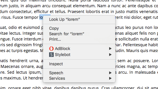
“Web design is 95% typography,” and the type that designers choose shapes how we experience the web. Several people have asked lately about how to tell which font is being used on a website. Here are two ways–one slightly technical and one fairly simple: Slightly technical: The “Inspect Element” tool Buried in your browser is […]

This article is in: Book Design, Design, Type Design, Typography, Web design


Gutenberg Bible

I was recently asked what the best font would be for designing material for kids who are learning to read. The truth is that the best font for kids, or for anyone, is always going to depend on the context. Readability is relative Readability in a font has a lot to do with what the […]

This article is in: Book Design, Books, Type Design, Typography


Palatino, from Anatomy of a Typeface, by Alexander Lawson

Hermann Zapf, the designer behind Zapfino, Palatino, Optima and many other typefaces, passed away last week. The world is more beautiful because of him.

This article is in: Community, Design, Type Design, Typography


Bembo's Zoo

As a parent teaching my kids about letters, it’s sometimes difficult to know which A to focus on.  What is the Platonic form of the lowercase A?  It may also be an occupational hazard that I want to tell them about serifs and italics and the difference between a two-story “a” and a one-story “a.”  And […]

This article is in: Book Design, Books, Community, Design, For EMM, Type Design, Typography


Crafting Type workshop

I’ve been getting more and more interested in typeface design over the past year.  A carpenter needs to know how trees grow and a chef should know something about the origin of the food that ends up on the plate.  In the same way, a designer who works with text and letterforms every day should have […]

This article is in: Community, Design, Identity, Travel, Type Design, Typography


Hard-to-read headlines in a brochure are obnoxious, but hard-to-read highway signs can be a hazard. For decades the typography used on US Highway signs was a patchwork, each sign maker creating letterforms according to his or her style.  Most of the early signs were hand-painted, and painted in uppercase letters because the lowercase is more […]

This article is in: Design, Illustration, Type Design, Typography


Identity design for the Orchestre Symphonique Genevois

Creating a brand identity is often limited to developing a logo, defining a color palette, and choosing a typeface or two.  These elements will go a long way to give an organization a unique look and feel, but often that unique look and feel could just as easily be applied to other similar organizations, or […]

This article is in: Branding, Identity, Logo Design, Type Design


It’s not easy to consider the forms of letters without taking into consideration their meaning. I recently traveled to see some friends and family in China and Korea.  While I was there, I was intrigued by the variety of typefaces used in signage and printed material for both Mandarin and Korean.  It presented a unique […]

This article is in: Design, Identity, Travel, Type Design, Typography


It’s not easy to consider the forms of letters without taking into consideration their meaning. When I saw Chinese characters, however, I didn’t have any choice. The only thing I could understand about the signs and ads in China was the emotional tone or mood created by the way the characters were presented. Take these […]

This article is in: For EMM, Travel, Type Design, Typography


Emmeline, not only do the people here in Japan use different words when they speak, they also use different letters when they write. See these letters?

This article is in: Design, For EMM, Travel, Type Design, Typography