It was the best of times, it was the worst of times, it was the age of wisdom, it was the age of foolishness, it was the epoch of belief, it was the epoch of incredulity, it was the season of Light, it was the season of Darkness, it was the spring of hope, it was the winter of despair, we had everything before us, we had nothing before us, we were all going direct to Heaven, we were all going direct the other way—in short, the period was so far like the present period that some of its noisiest authorities insisted on its being received, for good or for evil, in the superlative degree of comparison only.
Charles Dickens, A Tale of Two Cities, 1859
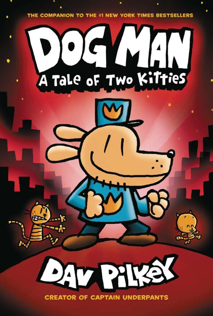
The paradoxical opening lines of Charles Dickens’ novel A Tale of Two Cities, first published in 1859 as a weekly serial, have been quoted and parodied in many different contexts. (See fig. 1, Dogman: A Tale of Two Kitties) “The best of times” which were simultaneously “the worst of times” refer to the years surrounding the French Revolution, from 1775 to about 1793. Without going into detail, it’s enough to say that the French Revolution was a time of incredible turmoil which saw the social and political order of France completely overthrown. Revolutionaries overturned the established authorities, arrested and executed thousands, were often themselves arrested and executed as shifting alliances and power dynamics created chaotic and unpredictable swings in events.
For the common people who had for so long lived under an oppressive and uncaring regime of elites, all of the chaos and social disorder surely felt like it could be the beginning of “a season of Light.” They may have been willing to endure some chaos in exchange for a life that was a little more bearable than the one they had known up to that point. For those in the established order, of course, the aristocracy and the ruling class, it must have been terrifying and would have been received as a cataclysmic misfortune. It’s easy to see why Dickens could say that the same time period could be described by some as “the spring of hope,” while for others it was “the winter of despair.”
A wink from Charles Dickens
This single introductory sentence (a long one, by today’s standards) is generally taken to mean that the years the author was describing were unprecedented, the likes of which had never been seen in history, and would not be seen again. On a closer reading, however, I think we see Dickens wink in the last phrase. After describing the unprecedented and superlative nature of that time they were living, he goes on to say “in fact, it was just like today” implying that the noisiest authorities of his own day had applied all of these same terms or similar ones to the news in matters of the day.
An inoculation against Presentism
At first glance, there is some dissonance in reading Aristotle to better understand Artificial Intelligence, or in reading Thomas Carlyle for insight into Adobe tools, or Benjamin Walter to think about social media. Reading these older sources, though, I find voices that are a little removed from the fog of our current situation. They don’t have preconceived notions about the issues of our day, because they’d never heard of them.
In the trenches of the day-to-day, it’s easy to think that our own time is the most remarkable time that has ever been—a time of chaos and upheaval, where world events and the political situation were shifting day today—but Dickens, writing almost a hundred years after the French Revolution, acknowledged that people in the 1850s felt just as breathless about their own time as the subjects of his book felt in the 1770s. Our presentism makes us biased to see our own situation as the most [choose your superlative] time that has ever been. Another term might be “temporal exceptionalism.” Just like reading fiction about people unlike yourself makes you more empathetic, reading old books helps inoculate us against that time-bound myopia.
Skin and bones
There are large stores of wisdom in the past. It’s easy to think that our own time is unique—that the challenges we face are unprecedented and cataclysmic. The truth is that although the details—the places, the names of the principal players, the technologies involved—are all new, people a lot like us have faced situations a lot like these many, many times before. In the same way that every 20 year-old feels like their parents the generation before them can’t possibly understand the new and complex realities, it can be tempting to think that the writers and thinkers of 100 or 500 or 2000 years ago won’t have any insight to offer about our present situation.
Artificial intelligence and climate change, fraught political situations and this generation’s “wars and rumors of wars,” can all seem like uncharted waters, but there are similar precedents and there is wisdom to be found in how people in the past faced similar situations.
There are recurring cycles, ups and downs, but the course of events is essentially the same, with small variations. It has been said that history repeats itself. This is perhaps not quite correct; it merely rhymes.
Theodor Reik, “The Unreachables”, 1965
Although the skin—the surface details—of today’s crises are different, the bones are the same.
Aerial view of Barcelona’s Eixample, a densely populated grid of residential and commercial mixed-use buildings
I’ve been thinking for some time about a phenomenon I’ve called The Midwest Small Town Inferiority Complex. I’m in the market for a catchier name, but the complex can be summarized in the following axiomatic statements:
Talent flows into big cities
Talent migrates toward the coasts
Therefore, anyone in a small town is either a) not talented, or b) is on their way to a large city or a coast
As a person who lives and works in a small midwestern town, I would like to think that the situation is more complex, and that talented designers doing good work can be found even in the hinterlands. I do think it’s possible, but I think that time, mathematics, culture, and human nature itself are working against me. The main points in the case against flyover country go like this:
Humans enrich the places where they spend time.
Humans build on existing culture.
Culture building is a function of multiplication, not addition.
More humans in one place equals more culture.
Longevity of occupation equals more culture.
More people over longer periods of time equals more culture.
Large cities have cultural gravitational pull
1
Humans enrich the places where they spend time
We have a natural tendency to make our mark on whatever we find. Sometimes that human tendency is destructive—children drawing on walls, or teenagers carving graffiti into picnic tables, or tourists sticking gum to national landmarks. But often that natural inclination to shape our spaces leads to improvements or even beauty. On the few times that I’ve gone camping and stayed in the same place for several days, I’ve noticed that there is a gravitational pull toward improving an otherwise wild place. We make a ring of stones to contain the campfire, which leads to a pile of sticks near the fire pit, and maybe we gather a few logs to sit on. Underneath the tent site, we clear out any stones and flatten any particularly lumpy parts of the earth. Even beyond the purely pragmatic changes we might make to a wild place, there are often traces of human activity that are purely aesthetic—a walking stick with a carved handle, or a geometric arrangement of sticks, or a handful of wildflowers gathered and left at the fire pit for the next campers.
C. S. Lewis observed that, “Man is a poetical animal and touches nothing which he does not adorn.” (Is Theology Poetry? essay, 1962) (Lewis was likely alluding to (and expanding on) Dr. Samuel Johnson’s 1774 epitaph for poet Oliver Goldsmith.) While there are too many instances of human occupation degrading an environment, there are also countless marvels in the built environment that show that our general tendency is to improve and enrich the spaces we occupy.
2
Humans build on existing culture
Ideas have a combinatorial nature—technological innovations like Gutenberg’s press or the Wright brothers’ airplane were the product of many component advances brought together, and artistic movements like Cubism or the Bauhaus were the result of many artists and designers working and thinking together. Those interactions were multiplicative, not additive. Systems thinkers are fond of pointing out that “the whole is more than the sum of its parts.” [Some would choose to phrase it, “the whole is different than the sum of its parts.”]
3
The mathematics of culture building
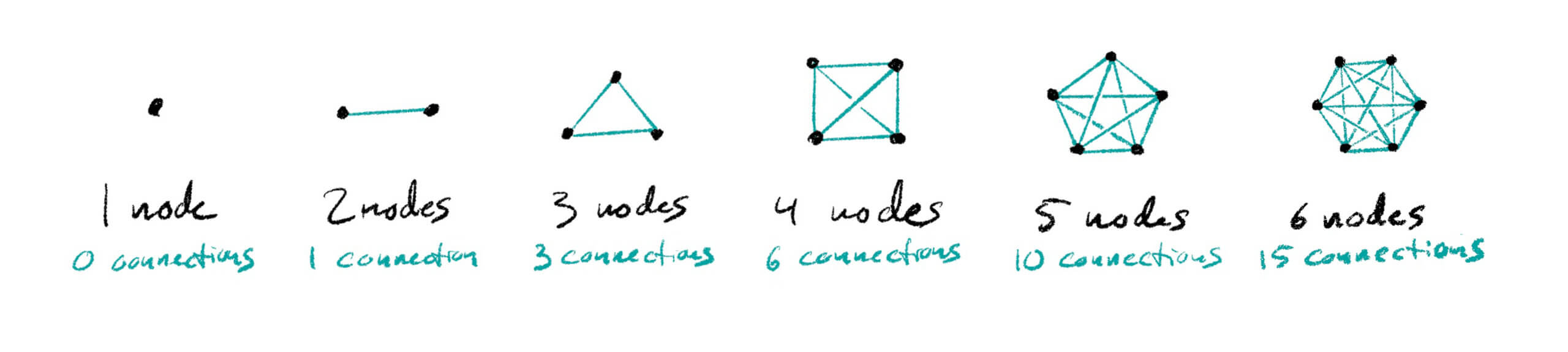
Network effects and Metcalfe’s Law
Robert Metcalfe originally developed his principle of network theory as a way to sell ethernet connections in the 1980s. In an interview, he said,
“Metcalfe’s Law began its life at about 1980 as a sales tool [in presentations] for my company to sell the Internet—specifically ethernet, which is the plumbing of the Internet—to customers. And this slide basically said that the cost of a network goes up linearly as you put the nodes on the network, but the number of possible connections goes up faster than that. It goes up as the square [of the number of nodes, that is, exponentially]. Then some years later in 1995, a young man named George Gilder was impressed with the idea and he called it Metcalfe’s Law, which basically says that ‘the value of a network goes up as a square of the number of users or attachments.’ So it’s an attempt to quantify the Network Effect.”
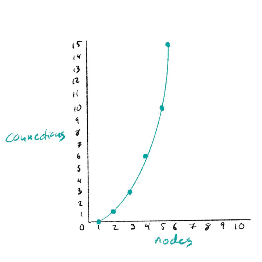
As nodes on a network are added linearly—one at a time—the value of the network increases exponentially. One person with a telephone is of no value, because no connections are possible. Two people with telephones starts to make sense, because there is now a single possible connection between the two people, or network nodes. Adding one more person to make this a network of three phones means that three possible connections can now be made. And adding a fourth person means there are now six possible ways that calls can be made, and so on into the stratosphere.
This theory means that every single node added to the network increases the value—the potential connections in that network—exponentially.
The many interconnecting nodes of human interaction that we call culture function similarly to a network. In a large city, cultural nodes like the tattoo shop, the art museum, the letterpress archive, and the dance studio don’t contribute to the city’s culture in an additive way—they contribute in a multiplicative or exponential way. The dance studio might stage a performance in the museum’s gallery, and the letterpress archive might prove to be a deep source of inspiration for the tattoo shop. Together those four “cultural nodes” are much more generative than the sum of their parts.
4
Population density equals more culture
Despite my hope that small towns can be home to greatness, I do think there is an undeniable reality that cultural richness is a product of population density. I mentioned above the combinatorial nature of cultural advances, and the network effect where each node makes the network exponentially more valuable. Those two considerations on their own point to large population centers having an advantage when it comes to culture building, and they seem to be firmly rooted in statistics and history. Add to that hard science something that sounds a little more mystical: the Water Cooler Effect.
Researchers at Harvard wanted to see how the productivity of collaborators was affected by their proximity—being physically near each other. They sifted through a large number of research papers to see how strong their research was, mapped against which study authors worked in the same building:
“Our data show that if the first and last authors are physically close, they get cited more, on average,” says research assistant Kyungjoon Lee. As that distance grew, citations generally declined. On average, a paper with four or fewer authors based in the same building was cited 45 percent more than one with authors in different buildings—“So if you put people who have the potential to collaborate close together,” he says, “it might lead to better results.”
The implications for culture growth are clear. The culture-building creative leaps rely on serendipitous collisions between unsuspecting passers-by just as much as they rest on talent and hard work. And cities are great at providing opportunities for collisions between unsuspecting passers-by.
5
Culture builds over time
At the heart of the University of Missouri campus in Columbia is Memorial Union, a gothic building with a large central arch that serves as an entrance to its two wings and crowned with four spires. The principal section of the building was completed in 1926 as a memorial to those who were killed in The Great War and it has served as the student union ever since.
My parents and I all attended the University of Missouri, although separated by about 30 years. (My mother went back to school later in life and completed a masters degree in counseling and a doctorate in psychology from the University of Missouri. We overlapped one semester—I was a freshman the semester she finished her PhD.) I remember my mom once she told me that as an undergrad in the early 70s she noticed the marble steps in Memorial Union were worn down in the center from years of student feet. She told me that her first impulse was to avoid walking where the steps were worn, so as to not contribute to the wearing.
After a year or so at the school, she changed her mind. She decided to walk in the scooped out part of the steps, in order to contribute to the legacy of the many feet that had walked on those stairs. I thought of her every time I walked on those steps, literally following in her footsteps. Together we shape the places we spend time, and the more human interactions concentrated in one place, the more those places are shaped.
There is a freshness and a grandeur in the wild and untouched places in the world–a few hours’ drive from where I’m writing the Badlands of South Dakota present a stunning natural spectacle. But that empty landscape and uncultivated hills don’t have much in the way of culture. I don’t mean that as an elitist critique—I mean that culture is a function of human interactions over time, and South Dakota is one of the most sparsely populated areas of the country. The relatively light human presence is why the land is mostly a pristine wilderness and also why there are not many cultural institutions.
Looking at Babylonian ziggurats, or Aztec and Mayan pyramids, or even archeological excavations in modern European cities you get a sense of a slow layering of years upon years of human interactions, creating more and more intricate webs of tradition and heritage and art. That cultural complexity is a product of the long layered years of interactions among generations of inhabitants, each generation building on what had come before. Cultural richness builds over time.
6
Population x Time = Culture
It’s surely not as simple as that pithy equation, but there’s a pretty strong case that says that a large city that has been established for a long time will provide a fertile ground for creativity and cultural innovation. There are certainly counter-examples—large cities with long histories that for a variety of reasons seem to be cultural dead zones
7
Large cities have cultural gravitational pull
Talented, creative people seeing to learn and grow and be challenged in their craft will always gravitate toward others like them. Designers will move to work where those people and studios are, and the large cities are mostly where they are found. Higher pay, more prestige, and more interesting work are most likely going to be found in larger markets.Big budgets and prestige projects also go to large and prestigious agencies, and to the victor go the spoils in terms of new projects and talented designers.
This isn’t a new phenomenon—some 700 years before Christ the author of Proverbs wrote,
Do you see a man skillful in his work? He will stand before kings; he will not stand before obscure men.
To the extent that the internet and remote work has flattened all the world into one large Zoom call, “anyone can work anywhere, from anywhere,” but the reality is that we will always be physical creatures, and the best place to spark a new idea or meet a new collaborator is going to be some version of the local letterpress poster archive or the office water cooler.
“Bloom where you’re planted?”
Or should it be, “Love the one you’re with”? If there is a tidy conclusion to this article, I haven’t yet grown wise enough to know it. It’s true that the complex alchemy of human interactions that happens in larger cities over time yields considerably more “culture” than places where humanity is more thinly layered. It’s also true that each single human on the planet is an infinite and complex world, if you take the time to know them. I’ll close with a recommendation from a friend to spend a few minutes listening to author and podcaster John Green tell about how he came to appreciate the richness of a seemingly drab and uncultured place. (h/t @tenley.s) I suspect that, just like with human relationships, what we “get out” of a place has a lot to do with how much we allow ourselves to know and love it, and how much we give to it.
There was a time when a printed book was a treasure. Costly materials and the laborious process of copying and binding a book by hand meant that only well-off members of society owned any books at all, and only the wealthy had more than a few books. Not only was the physical book a precious thing—the ideas committed to the expensive paper and bound up within a book’s covers were themselves the product of years of thought. After thinking and developing their ideas, committing those thoughts to paper in writing a book was the culmination of a long and careful process.
Books as treasure: carefully written and difficult to produce
Books were once very difficult to produce. This made them very expensive and very rare. Books that were produced at this time would have been household treasures, protected and passed down to the next generation. The high cost of book production meant that only the most valuable texts were reproduced in book form. It was so much trouble to give language a durable physical form that book makers were very selective with what they decided to print.
Mass street literature: easy to produce, quickly written
If books were valuable when they were carefully written and hard to produce, the advent of mechanical press and the later ruthless efficiency of industrialized printing turn that equation upside down. The industrialization of book printing meant that books could be produced more cheaply. As the production of books became easier and cheaper, it meant that there was a much lower bar for the material that was worth printing.
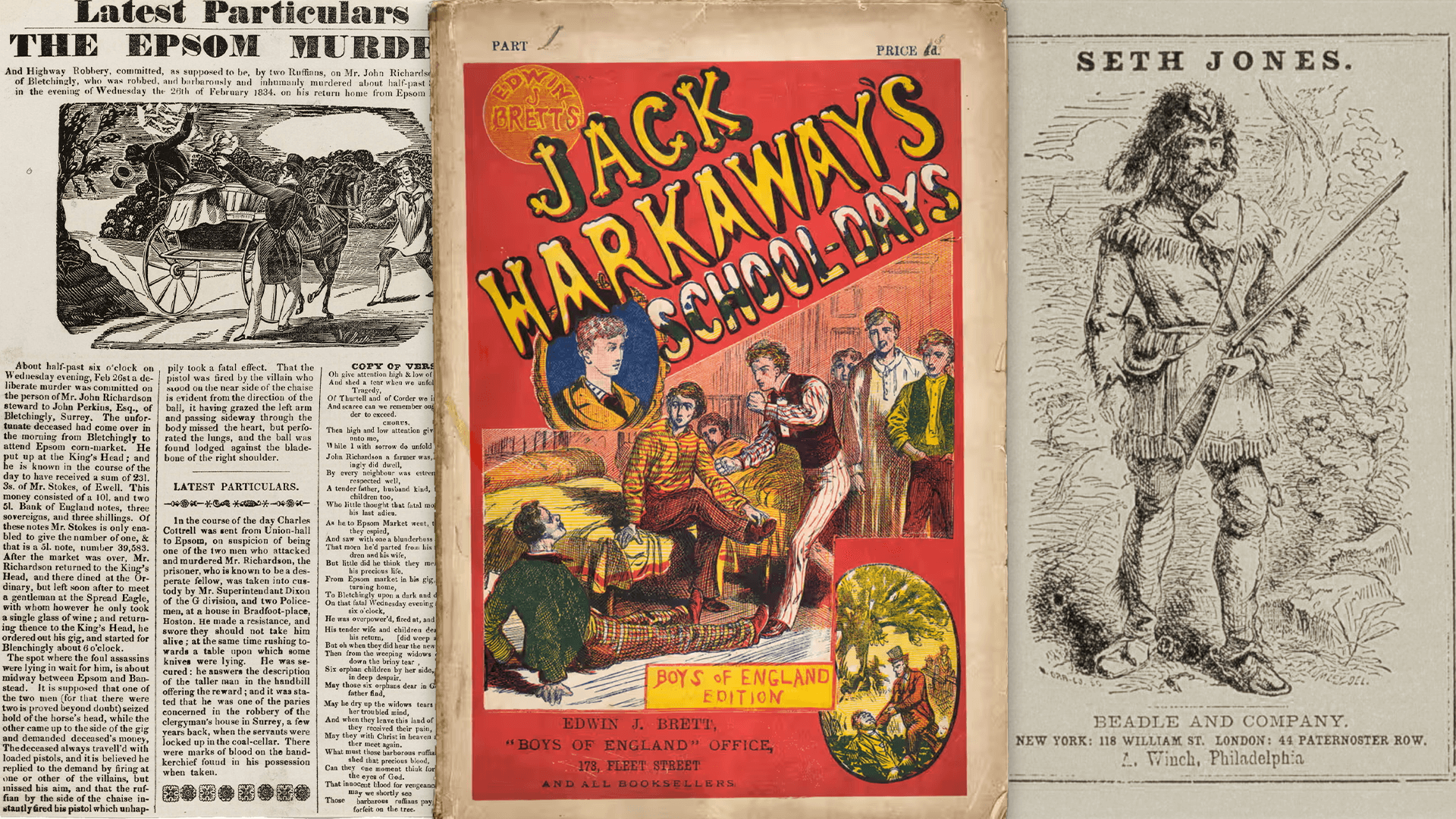
Crime Broadsides
In the 18th and 19th century, crime broadsides were a common form of printed media in the United Kingdom. A single-sided printed page, roughly the size of a modern 8 1/2 x 11 sheet of paper, these broadsides generally provided the details of the crime and the punishment that had been meted out. They often included a woodcut illustration, either a depiction of the crime or of the criminal’s execution. Cheaply printed and sensationally written, these broadsides were often sold at the public execution, but also had a larger reach:
Crime broadsides were also distributed across England and Wales by itinerant peddlers, far from the courts and gallows of the major cities and towns. They are one of the earliest examples of mass street literature. In addition to sometimes lurid descriptions of the crime and trials, many execution broadsides featured the “dying speeches” or confessions and last words of convicts on the scaffold, sometimes in the form of poetry. Often there were warnings to would-be criminals. Increasingly, broadsides were illustrated with wood engravings, showing the execution scene or vignettes of the crime scene.
These broadsides, precursors to the mass newspapers that eventually eclipsed them, offered their readers a sense of the world beyond their own location and experience. They were presented to the reader as factual accounts, but as they became more popular there was an inclination to sensationalize the facts they presented. The appeal of the broadsides, the overall increase in literacy rates, and the ability to produce and distribute printed material on a large scale all contributed to the rise of reading as a new form of entertainment.
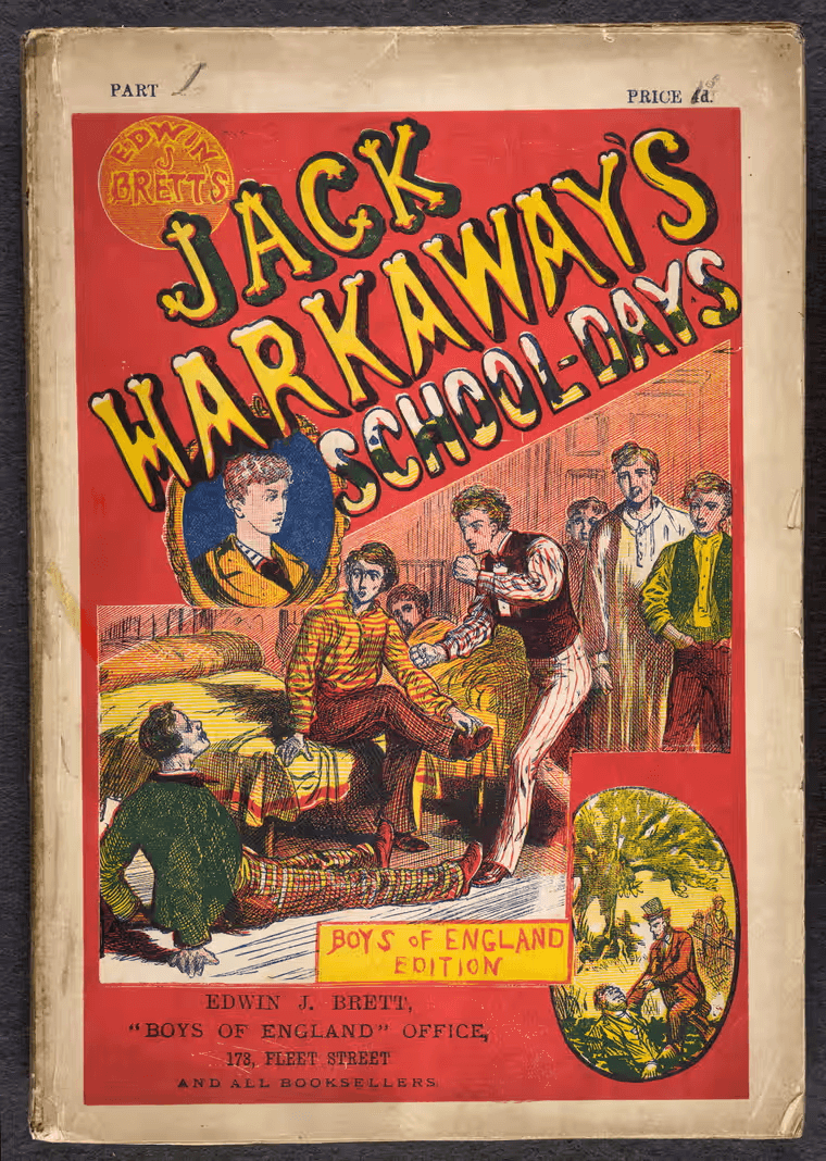
Penny dreadfuls
This appetite throughout mid-Victorian Britain for cheap, interesting reading material was answered in part by the “penny dreadfuls.” These were cheaply produced serial magazines that featured stories of adventure and travel, crime and detectives, and sometimes even early science fiction. They were so popular that between 1830 and 1850 records show there were nearly 100 publishers of penny fiction or penny bloods, as they were sometimes called. They varied physically, but seem to have ranged from 6 1/2 – 9 inches tall, printed on cheap paper with hastily done cover illustrations to catch the attention of potential readers. Most penny dreadfuls seem to have been between 8 to 28 pages, but since the stories ran through multiple issues, a single story would span many more pages. One archived exemplar at the British Library,Captain Macheath; or, the highwayman of a century since!, is listed on the library entry at “270 pages,” but notes that it was “published in 17 parts.”
By 1895, politicians and police alike were concerned about the effect these “immoral” and “escapist” reading materials were having on the those who consumed them. The penny dreadfuls were written in a way that primarily appealed to young men, and many reckless acts, violent crimes, and even suicides were attributed to the influence of type of fiction on this impressionable demographic. After a particularly troubling crime was committed in 1895 by two boys who had been reading these materials, calls were renewed to ban the popular penny dreadfuls, but those efforts came to nothing:
That summer several newspapers echoed the inquest jury’s call to ban penny dreadfuls, but the home secretary reminded the House of Commons in August that an inquiry of 1888 had been unable to establish a connection between cheap books and juvenile crime. Though penny dreadfuls were continually being discovered in the bedrooms and pockets of young criminals and suicides, this may have been only because they were in the bedrooms and pockets of most boys in Britain.
“Penny dreadfuls” can also be seen as a British subset of the larger category of story papers. Sometimes described as “literary magazines aimed at children and teenagers” and sometimes “the television of their day, containing a variety of serial stories and articles, with something aimed at each member of the family.” The first well-known story paper was produced in Britain in 1832 and they seem to have been continually produced until at least 1967. They were “weekly, eight-page newspaper-like publications, varying in size from tabloid to full-size newspaper format and usually costing five or six cents.” (For more, read George Orwell’s 1940 essay “Boy’s Weekly”, and look at the American legacy of story papers as well.)
A number of popular story papers in America later provided content for a new class of mass literature. In a (barely) United States on the brink of the American Civil War, Beadle’s Dime Novels were first published in 1860 by Erastus and Irwin Beadle. The books in the Beadle series were small by modern standards—about 6 1/2 x 4 1/4” and 100 pages—and very simple: “The first 28 were published without a cover illustration, in a salmon-colored paper wrapper. A woodblock print was added in issue 29, and the first 28 were reprinted with illustrated covers. The books were priced, of course, at ten cents.”
Publishers printed (and reprinted) these dime novels in a variety of formats, and confusingly sold them for prices ranging from 5 to 15 cents. Generally each book was a standalone story, but series of stories following an established cast of characters grew more and more popular.
Pulp magazines and pulp fiction
Dime novels were cheap to make, but the pulp magazines that eventually edged them out were even cheaper. Every history of the pulp magazines begins in the early 1880s with a man named from Augusta, Maine who moved to New York to start a magazine. Frank Munsey had been working for several years to gather capital and manuscripts to begin publishing a periodical literary magazine, and in December 1882, The Golden Argosy published its first edition—8 pages long, selling for five cents a copy. By 1887 it would have a circulation of 115,000. The magazine was published continuously from 1882 until 1979. It did switch from weekly to monthly for some seasons, and under several variations on the original name, eventually settling on simply Argosy. It merged with several other magazines along the way, sometimes incorporating the acquired magazine’s name for a few issues. The All-Story Weekly was a significant one of these acquisitions, especially for fans of science fiction.
Among the many changes in Argosy’s format, two of the most historically significant happened in 1896. In October, the magazine became the first magazine to print only fiction, and the December issue was printed on cheap wood-pulp paper, making it the first pulp magazine. (The December issue was also the first Argosy issue to feature science fiction.)
As a book designer, I’ve often told clients that the cover of their book makes promises that the reader expects the interior to fulfill. Book publishers—those components of the publishing mechanism who are mostly keenly aware of the financial equation—generally think of the cover art primarily as a poster or advertisement to sell the book to potential readers.
Pulp fiction artists were in an odd position in what we think of as the normal flow of book production. In an era of cheap printing and cheap writing, the cover art was such a large part of the marketing of the book that the written content was often created to support the cover artwork:
“Pulps were most known for their exploitative fiction and controversial cover art. Pulp covers were always on higher quality paper and were usually high contrast and brightly saturated colors. The cover art on pulps were so important to the publication, that often times the art was actually made first. After it was made, it was then shown to the authors to come up with the magazine’s content based on that cover artwork.“
Mai Ly Degnan, Pulp Magazines and their Influence on Entertainment Today (nrm.org)
The legacy of the cheap book
As interesting as the history is, these forms of printed matter also contain a lot of problematic material. From the early crime broadsides, publishers were presenting the worst things that had happened in a community as entertainment disguised as news. The penny dreadfuls relied on the macabre and the weird to sell their issues, and readers who were looking for adventures beyond everyday life were drawn to the strangeness and alien quality of the stories they told. The pulp magazines, with their dependence on quick writing and cheap production had no qualms about relying on exploitative imagery and racist tropes to appeal to their audiences.
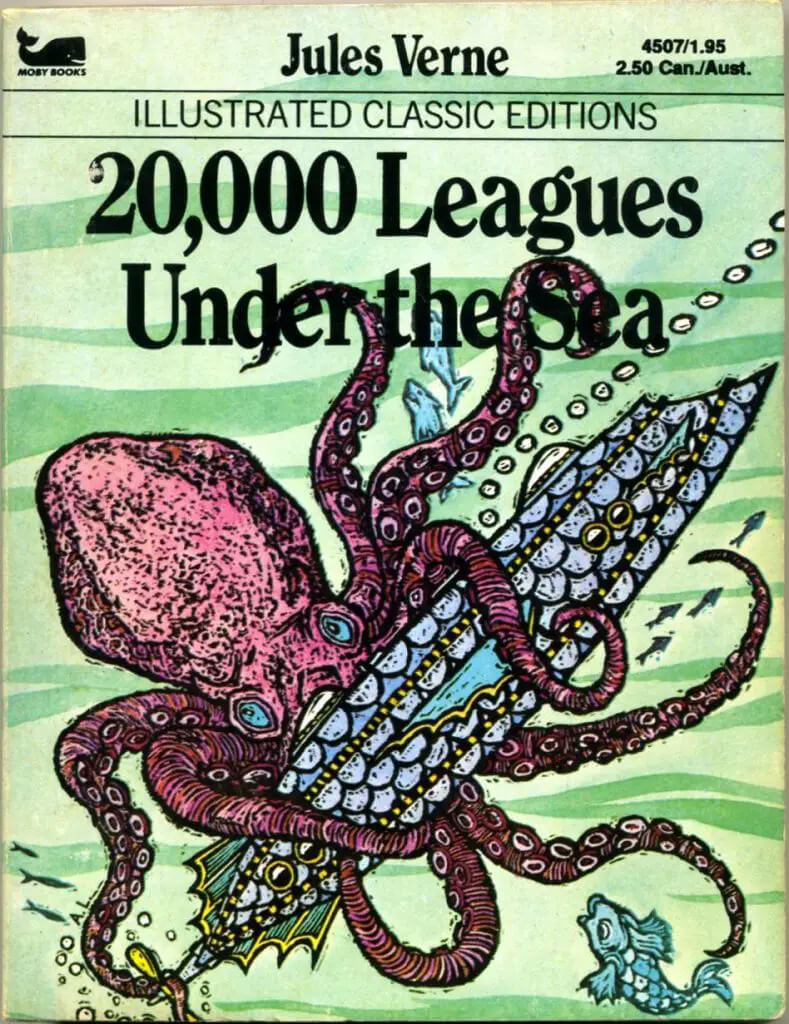
I’d like to look more into the legacy of these forms of cheap mass literature. There are clearly some lines of descent from the penny dreadfuls with their heroes and villains and adventures to the comic books you can pick up today. There also seems to be a clear line to be drawn from the crime broadsides to the sensationalized crime reporting presented by networks like Fox News, or the Unsolved Mysteries series of the 1980s and 90s, or the current interest in true crime podcasts. My own childhood was full of a series of the “Illustrated Classics Editions” from Moby Books. (Moby Dick was one of the titles in the series, and I never appreciated the publisher’s name or logo until researching for this article.) Looking at them now, I can see some echoes of the pulp tradition in these illustrated and heavily abridged classics.
“Ladies and Gentlemen, behold: The Enemy:” He raised the blinds, and there was the street below. Townies going up and down upon the land. Greased, efficient gears in the Village engine. Harmless. “Relentless. Unstoppable. You cannot hope to defeat them. Nor, as a matter of fact, would you want to. Their defeat also means yours. When a host dies, he takes his virus with him. Viruses are fools—they work toward their own extinction. Not you. You will sustain the enemy as long as possible, and flourish.
“So why are they the enemy? Because they are bent on destroying you. They did it yesterday. They’ll do it tomorrow. They’re curing themselves of you as I speak—their serum is Indifference. Your job is to infect them, to elude the antidote, and to thrive. To make your thoughts into their obsessions, your whims into their rapacious desires. And I will show you how to do it. If this isn’t what you had in mind, leave now to join them and become our food and save me considerable trouble. My job is to give you courage, cunning, power. To make you strong. To make you smarter. To make you ruthless. Because when you leave here, you are not just going to work. “You are going to war.”
Chip Kidd gives these words to Winter Sorbeck, his narrator’s mentor and foil at the open of his novel, The Cheese Monkeys. This is our tongue-in-cheek introduction to the relationship between the graphic designer and their audience. I’m not sure the reader is supposed to take his pronouncement at face value, given the character’s antagonistic and borderline exploitative relationships with everyone else in the novel, but the overall sentiment certainly pervades some sectors of graphic design culture.
What should the designer’s relationship be to the audience? “Audience” itself is a revealing choice of words. Audience implies a passive listener—a ready recipient of whatever is presented. Other possible terms also present the relationship in different frames—user, consumer, visitor, reader. Each of these implies a different power dynamic between the designer and the [insert term of choice here.]
The Designer as Interpreter
After living in Barcelona for nearly four years, I returned home to the United States and worked for several years as a Spanish interpreter. This role placed me in many and varied contexts, from social services and parent-teacher conferences to law enforcement interviews and meetings between lawyers and their clients in the state penitentiary.
Of all these interactions, by far the most common type of interpreting appointment was between a patient and their health care provider. In medical appointments, as in most of these conversations, the English speaker and the Spanish speaker were on the same side. That is to say, they both had shared objectives and goals—they both wanted to understand and be understood. In that sense, these conversations were collaborative or cooperative.
But in some cases, most notably those that involved law enforcement and sometimes social services, the two parties on either side of me were not on the same side. In some cases one side wished to hide something from the other, or did not trust that their conversation partner had their best interest at heart. In those cases, the conversation could be described as adversarial.
Adversarial Design
I would like to consider this last type of interpreting as an interesting analogy for the role of a designer. The graphic designer generally finds themselves between a client and the client’s audience. The client had some intention toward the audience, and the audience or user has some need or intention toward the client. In the case of a coffee shop, the customer wants to know what items are on the menu and how much they cost, and the coffee shop management wants to show the customer the same things. The role of the designer in a situation like this is to facilitate that information exchange in an interesting and pleasant way. These scenarios are what I would call collaborative or cooperative graphic design.
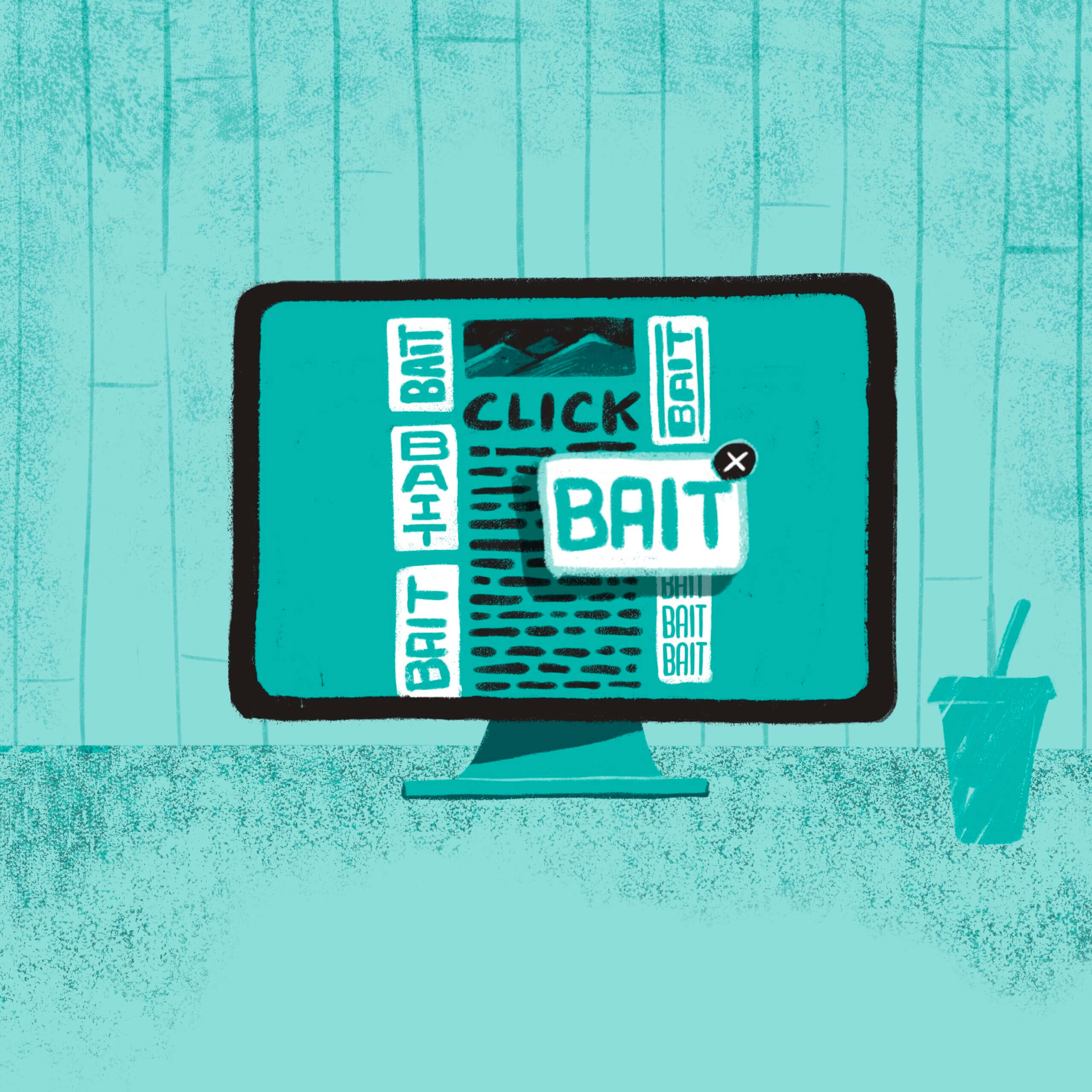
There are other situations, however, where I’m not sure it can be said that the audience and the client have the same interests. Or at least that their interests do not exactly align. When I’m reading the news online and find the content I want to read peppered with pop-up ads and clickbait ads, it feels aggressive and almost violent. When I find myself driving down the interstate, thinking about my work or my children, or my plans for the day, and a billboard or advertisement inserts itself into my attention, it’s generally not a welcome intrusion.
Adversarial Design in other fields
In most cases a designer is trying to aid or improve the life of their audience, but there are scenarios where designers are sometimes called to work against their intended audience. Design and architecture podcast 99% Invisible has an interesting parallel discussion on Unpleasant Design & Hostile Urban Architecture.
I may have some genuine need for whatever product is being advertised, or I may at some future time have a need for it, but in that scenario the designer, on behalf of their client, has forcibly stolen my attention from me. Instead of thinking about my work, or family, or the project at hand, I am now (against my will and without my consent) thinking about the pet store or real estate agent who paid a designer to interrupt my train of thought.
If I were sitting down with my wife at a restaurant in the middle of a conversation and that same real estate agent sat down at our table and interrupted our conversation, it would be the height of rudeness. But we permit that same level of intrusion through a sign or an aggressive digital ad.
In defense of curiosity
Curiosity is a positive thing. We want our fellow citizens, our children, even our scientists and policymakers, to be curious about the world around them. Curiosity is a valuable trait for survival, for learning about things beyond the familiar, for widening your perspective about the world around you, and it should be encouraged rather than punished.
I think of myself as a curious person and in general I value curiosity. There is value in exploring new ideas and following a train of thought or an interesting topic. The problem with this sort of intrusive or even coercive design is that it is weaponizing my curiosity against me. Static billboards and signs at the bus stop are bad enough, but we see more and more intrusive advertising and messaging in the growing competition for the audience’s attention.
Of course there are many situations where it’s permissible and even desirable to intrude, to interrupt a conversation or to break someone’s concentration. Fire alarms, warning signs, ambulance sirens, and street signs are all examples of situations where we are interrupted and grateful for the interruption.
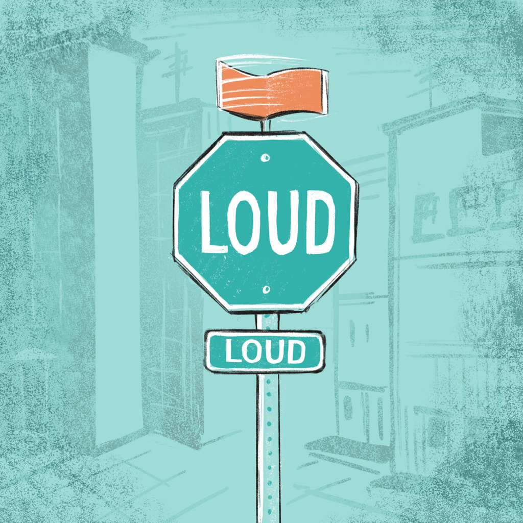
On some busy street corners in our city where stop signs have gone unnoticed or ignored, traffic engineers have added a spinning device on top of the stop signs to catch the attention of distracted drivers. Propelled by the wind, these spinning devices flash orange and white and draw the driver’s eyes, adding “an extra degree of attention to any traffic control device” in an effort to help increase safety at the problematic intersection. This is an intrusion into the drivers’ attention, but for a good and desirable outcome for everyone involved, whether pedestrians or motorists.
Attention as a commodity
Attention has become one of the most valuable commodities in our economy. Billions are spent every year to capture and monetize the attention of consumers. The value of this commodity is a fact recognized by projects like the Basic Attention Token or BAT. The BAT is a feature used and promoted by the developers of the Brave browser, is an alternative web browser built on the Chrome browser’s framework.
The idea according to Brave is that the BAT is “a utility token based on the Ethereum technology that can also be used as a unit of account between advertisers, publishers, and users in a new, blockchain-based digital advertising and services platform.” Their goal is to show that BAT will be used “to directly measure, exchange, and verify attention.”
While it’s not intended to be a currency like Bitcoin, BAT is a digital token that can be used as a medium of exchange within. Instead of advertisers and content creators trading in dollars, for example, they could use Basic Attention Tokens to keep account of ad revenue. To me, the interesting feature of this conversation is that the unit of account, or the unit of value, is a unit of attention. This marks a tacit recognition that our attention is the valuable commodity that is being traded between ourselves as users and content consumers, content providers, and advertisers.
So what is attention worth?
Quite a lot. According to a recent study, advertisers will spend nearly $300 billion this year to capture our attention and direct that attention wherever their clients have asked them to. Aside from the annoyance or bother this may entail for us as consumers, I believe it also raises some ethical questions for designers as it concerns our role in what Chip Kidd’s Winter Sorbeck called “the war” for our audience’s attention.
An attention fiduciary
In financial arrangements, a fiduciary is a person who is in a position of trust to their client and as such has a legal and ethical responsibility to act in the client’s best interest. In a sense designers hold that same position of trust with both our audiences and our clients. The client has hired us to “capture” attention, so our obligation to the client is clear. But what about the owner of that attention? What obligation or duty do we have to them, our intended audience? What gives us the right to capture and direct that attention? When is it permissible to override someone’s attention or disrupt their train of thought? What code or creed should guide our work?
Next steps
I will continue to examine the role (and obligations) of the designer in situations where we are called upon by the client to direct the attention of their audience, and as a profession, we should do more to explore the ethical limits and responsibilities designers should honor as they conduct their work.
Art may follow the muse, but design always has a goal. The work of the graphic designer is to exercise creativity in the service of some purpose. While the artist has the freedom to express and explore—in a sense, to ask questions and create “problems” for the audience—the designer is always working to solve some problem on behalf of the audience.
Design is hospitality.
At a basic level, the designer plays the role of a thoughtful host, welcoming the audience into an unfamiliar space and guiding their attention around the material in a way that makes them feel at home.
Design is gift-giving.
A design project is not complete until it has been put to its intended use. A designer working to create a piece for the audience experiences the same joyful expectation that a gift-giver has in choosing and wrapping a Christmas present— but the gift has not really been given until it is unwrapped and enjoyed.
Design is teaching.
The designer takes the time to thoroughly understand the material he or she is presenting, to sort and order and arrange that material, and to guide the uninitiated audience through it. The writers’ maxim that “easy reading requires hard writing” hold true for us as well—if the designer doesn’t do the work to create a thoughtful design, the audience will have that much more work in trying to decipher the final piece.
Design promotes human flourishing.
Signs that help us navigate the streets, books that are easy to read, menus that help us find our preferred foods—graphic design done well is design that serves people well. In fact, design is only worth doing to the extent that it promotes human flourishing. The street signs, or books, or menus will all eventually be mouldering in the landfill but the humans we have served are eternal. The graphic design industry is sometimes guilty of a condescending attitude toward clients who say, “just make the logo bigger” or give unhelpful feedback like, “I don’t know what I want, but I’ll know it when I see it.” While those can be frustrating exchanges, the designer cannot permit himself to adopt a sneering posture toward the client. In the end, the ultimate measure of the value of a designer’s work is how well it serves two sets of people: the client, and their audience.


")