What’s the best font for kids?
I was recently asked what the best font would be for designing material for kids who are learning to read. The truth is that the best font for kids, or for anyone, is always going to depend on the context.
Readability is relative
Readability in a font has a lot to do with what the reader is accustomed to reading. When the German printers first started developing moveable type they used the letterforms that reflected how the scribes of the time wrote: Blackletter.
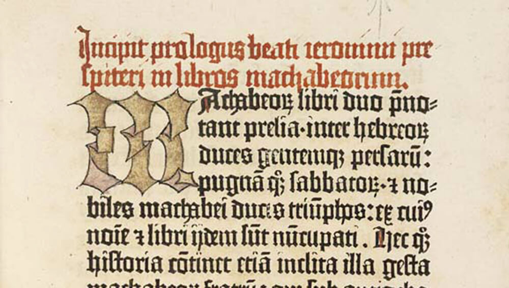
The Gutenberg Bible, (Inc. 1), the National Library of Scotland. Digitized by the HUMI Project, Keio University July 2005. Beautiful, but not the best font for kids.
For modern eyes, this is nearly unreadable, but to the first readers of Gutenberg’s printed pages in the early 1400’s it was what they were accustomed to read.
Simple letters are best
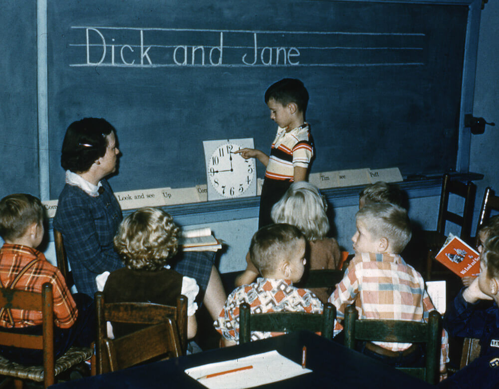
For young readers who are just beginning to recognize letterforms, the best font choice will be something with very few surprises or quirks in the shapes of the letters. Although many people in the design community feel that Helvetica is overused, it might be a good choice for kids precisely because it’s so common. A more classic choice would be Century Schoolbook, the typeface used for the iconic and monumentally boring Dick and Jane books.
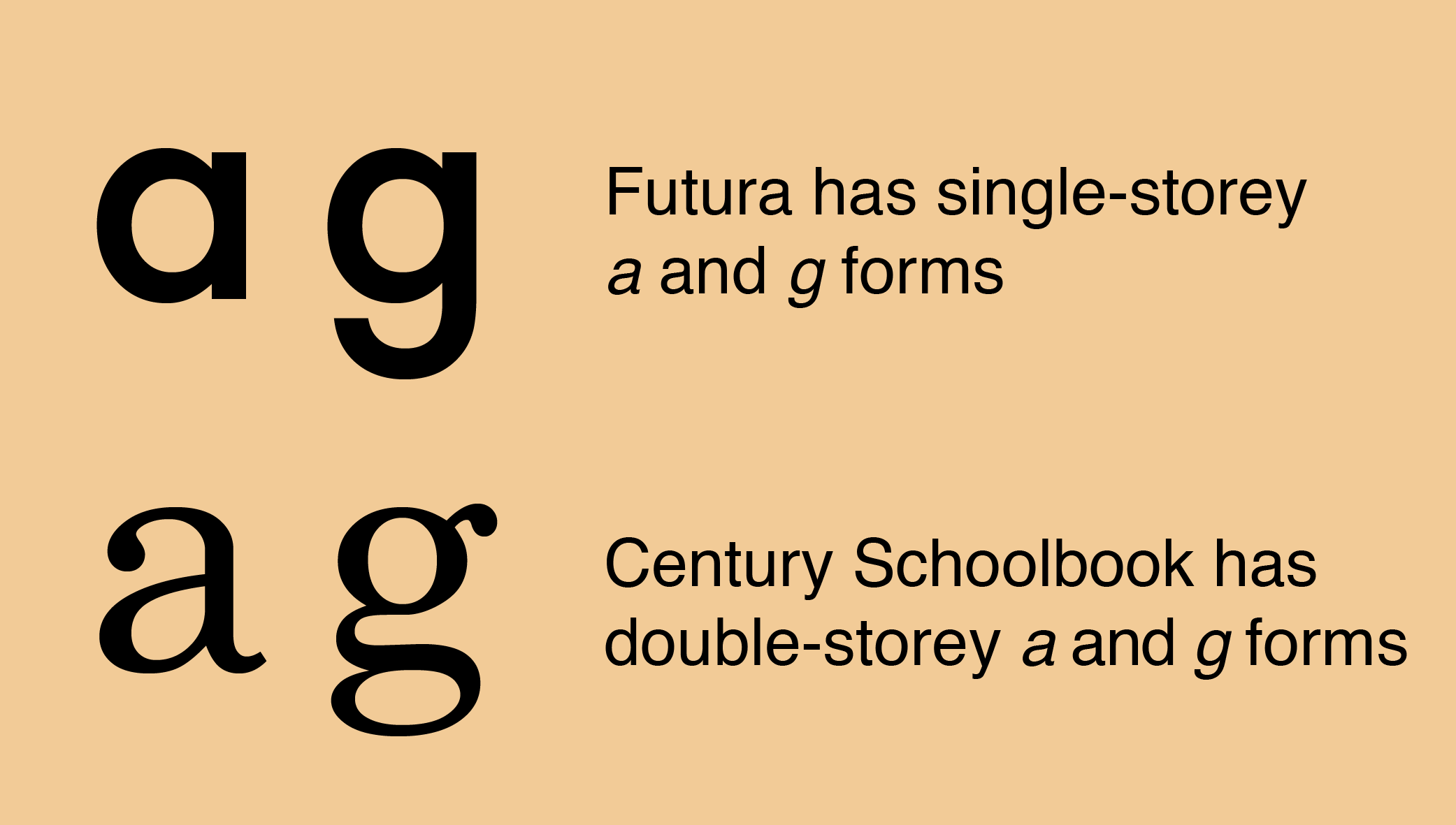
Another consideration is that young readers are also learning to write. The best font for kids might be a typeface that is very close to the letterforms that kids are learning to write. Futura, for example, uses the “one-storey” lowercase “a” and “g” rather than the “double-storey” form, and that might make the text more accessible to kids.
Don’t use all caps
If you’re designing for kids (or anyone, really) you should avoid using all capital letters, since that also hinders reading. (See Clearview–a study in legibility) Uppercase text on the other hand makes every word a rectangle We tend to read word by word, rather than letter by letter, and mixed case text, or text that uses upper- and lower-case letters, gives each word a unique profile that is easier to recognize.
The best fonts for kids aren’t the childish ones
As a final note, I would avoid using “childish” fonts like Comic Sans or a chalkboard font when designing for kids. I don’t say this because of a snobbish view of those fonts–they have their place. Kids learn to talk by imitating, as closely as they are able, proper speech. We shouldn’t use “baby talk” when we’re talking with kids, because we want them to learn to speak well. In the same way, our goal when creating printed materials for kids is to give them a model of how printed letters should look, not to echo back the errors they may already be making.
To read more articles like this visit: Book Design, Books, Type Design, Typography