Clearview–a study in legibility
Hard-to-read headlines in a brochure are obnoxious, but hard-to-read highway signs can be a hazard.
For decades the typography used on US Highway signs was a patchwork, each sign maker creating letterforms according to his or her style. Most of the early signs were hand-painted, and painted in uppercase letters because the lowercase is more difficult to paint. Unfortunately, text written in uppercase letters is more difficult to read. (Ask the US Navy.)
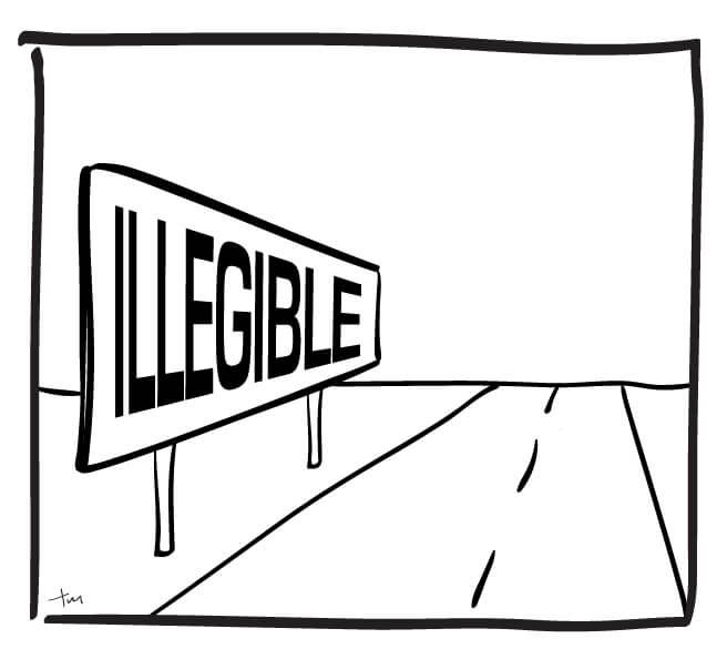
For this reason, street and highway signs are now written in a mixture of upper- and lowercase letters. It’s been proven to be easier to read under a variety of conditions. James Montalbano is a type designer who collaborated in the creation of Clearview, the typeface which is now used on most highway signs through the US. In an interview for a New York Times article on Clearview, Montalbano gave this illustration of why a combination of upper- and lowercase letters is more readable:
If a word is set in all caps, all you will see are little white rectangles,” he said, scribbling a quick “HELLO” on a napkin. The word looked heavy, almost industrial.
But this has a definite profile,” he continued, and then he drew “Hello” again on another napkin, this time in a mix of upper- and lowercase letters, its peaks and curves and dips setting off all the necessary clues in the subconscious. He held the paper in front of me. As he slowly pulled it farther away, the individual letters became harder to read, but the shape of the word remained distinct. “Your brain,” he concluded, “knows the shape of the word.”
Clearview has a high x-height which allows for large, easy-to-see lowercase letters that still retain the unique profile of the word. It also features large counters (the spaces or bowls in letters like “p,” “c” or “o”) which creates visual space without sacrificing the sense of the letter. Take a look at these examples, from the ClearviewHwy field tests:

In design, context is everything. While Clearview may be more legible on a sign, it would be tiring to read a entire book set in Clearview. One is more legible, and the other more readable. (Although there is now a Clearview Text font, so feel free.)
To read more articles like this visit: Design, Illustration, Type Design, Typography