Paperback

Design studio focused on book design, illustration, and environment design


Say

Hello

What is a raster image? What other kind of image is there?

You might think that a picture is a picture but when it comes to using your images in print or on the web, there are some very important distinctions to be made. The most important of these distinctions is between vector images and raster images.

Vector images appear smooth and clean no matter what size they are displayed

Vector images appear smooth and clean no matter what size they are displayed

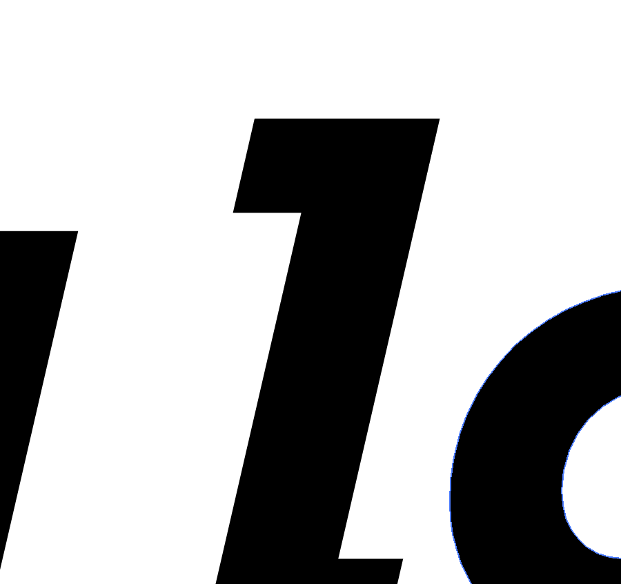
When a raster image is scaled up, the image degrades and you begin to see the individual blocks of color

When a raster image is scaled up, you begin to see the individual blocks of color


What are vector graphics?

A vector graphic isn’t an image so much as a mathematical recipe for building the image and doesn’t have any limitations in terms of size. Vector graphics are infinitely scalable–if you have your logo in a vector format, you can use that file for a business card or for a billboard and the image quality will be the same. Common vector file types include .AI, .EPS, .PDF (sometimes) and .SVG files.

So what is a raster image?

generic-logo_raster closerup

A raster image is built of small blocks of color. When scaled up those blocks are scaled as well and look pretty rough, especially on curves.

Put simply, raster images are built out of blocks of color (pixels), and vector images are built out of a series of mathematical instructions. A raster image only contains enough information to display the image of a logo (or a cat, for most of the internet) at a certain size. If you display that raster image at a larger size than it was created to cover, it begins to appear as blocks of color rather than smooth shapes.

Pixels: Little blocks of color

Most images used by most people are raster images, and are pixel-based file types. The raster image file types that I use on a daily basis are GIF, TIF, PSD, RAW, JPG, and PNG. Each one was developed for a different reason and each file type has it’s own hidden superpower. (Some were developed in an unsuccessful attempt replace the others.)

GIF

The Graphics Interchange Format, or GIF, was one of the earliest image formats but is still a mainstay of the visual internet. Of all the schisms in the design world, the divide over the pronunciation of this file type is possibly the most bitter. This might be the best answer.) Limited to 256 colors, the GIF can’t display images in a way that takes advantage of the full range of most modern screens. That limitation, along with a patent issue, was one of the main reasons for the development of the PNG format. Unlike the other file types listed here, GIFs can be strung together into short video animations. Animated or still, the humble GIF remains one of the most common image types on the internet. Avoid using GIFs in print, though–especially the animated ones. That’s just not going to work.

Superpower: Movement. GIFs can be animated, creating compelling or inane little repeating videos.

[Update: Front-end web developer Sara Soueidan recently put together a deep dive exploration into the ways that the SVG format is overtaking GIF in many of the capabilities that until now made the GIF indispensable.]

TIF

Tagged Image File Format is a less common image type, but it’s a powerful tool in the toolbox. The TIF is a “lossless” file format, meaning that no image information is lost when saving. TIF images can also be layered like a PSD, and can contain vector clipping masks making them an ideal format for high resolution print production. The downside of all that uncompressed information is that TIFs are often massive files, and can’t be read by many devices and users.

Superpower: Memory. The TIF is a high resolution, lossless image format. Also layers!

JPG

The JPG (or sometimes JPEG) is named after the Joint Photographic Experts Group who created it and is one of the workhorse image types in use today. It’s the default image type created by digital cameras and is used widely both in print and online. The JPG is capable of rendering images in a “Lossy compression”, and this compression is both its strength and its biggest weakness. (Let’s all reflect for a moment on this metaphor for the dual nature of our own strengths and weaknesses. Great–on we go.) These images show both the advantages and downsides of the JPG compression:

JPG compression comparison-01

This image (with the same pixel dimensions) when compressed from 5.6 megabyte (on the left) is 900kb (center) and 185kb (right). In the context of a complicated image, especially in high contrast images, the compression artifacts are not as apparent, and the savings in terms of file size might be worth the quality loss in some situations.

JPG compression comparison-02

If this image were going to be used at larger scales, the artifacts would be distracting.The JPG compression algorithm is especially harsh in areas that should be smooth gradients and subtle variations in color.

JPG compression comparison-03

Even in a simple gradient the way that the compression algorithm averages areas of color creates banding at first and then large unsightly blocks of color at the extreme end.


Superpower: Adaptability. Variable compression and a jack of all trades. When in doubt, use a JPG–they’re versatile and can be viewed by most users on most devices. 

PNG

Portable Network Graphics, or PNGs, have most of the same capabilities as the JPG format with a few key distinctions. First, PNG image compression is “lossless”, meaning that the image quality doesn’t degrade every time you save the file. Second and more importantly, the PNG format supports transparency. This fact alone is one of the reasons for the PNG’s popularity on the web. The first image here is a JPG, 600px x 300px at 150ppi (pixels per inch), and there’s nothing wrong with the image, especially if you like white boxes around your logos. The second image is a PNG, also 600px x 300px at 150ppi.


generic logo_150ppi-600x300px generic logo_150ppi-600x300px

Both the images are the same resolution and present colors and gradients equally well, but the PNG file type allows for a transparent background. No unsightly white boxes, thank you. Transparency and lossless compression have made the PNG one of most commonly used image formats on the web today. PNGs were not originally intended for use in print and although that distinction seems to be breaking down they are best reserved for use in designing for the web. (For even faster load times, use a compression service like TinyPNG to shrink your PNG images.)

Superpower: Invisibility. PNGs can have transparent backgrounds.

RAW

The RAW format is not as common for most casual image users, but it’s a go-to file format for serious photographers. Digital cameras are essentially little computers equipped with a lens and a sensor. The lens can gather infinite amounts of information, and the sensor receives and allows the processor to record some fixed amount of that information. Even in a simple image, there is a vast amount of information available—the amount of light, the tone and color of the light, the degree of detail present, etc. When those images are recorded as JPGs, the default for most cameras, the majority of the visual information the lens and the sensor gather are discarded. This creates a manageable file size and still produces a decent image.

The advantage that the RAW format has is that it records and retains a much larger range of that original image. The photographer can then access that original information later when they are processing the photo. If the captured image was too dark, or if the white balance was off, they can adjust those settings almost as if they were retaking the photo.

Superpower: Time travel, basically. RAW files contain scads of information from the moment the photo was taken, allowing photographers to go back and “retake” the photo using different settings.

PSD

The Photoshop Document, the mighty PSD, is the godfather of all other image types. You begin by defining the resolution and the size of your document in pixels, but there the line between vector and raster image begins to blur a bit. Adobe Photoshop, and therefore the PSD format, has gotten more and more complex–recent iterations of the program handle vector graphics (as “Smart Shapes“). Users can compose and create just about any image they can dream up. Users can edit a PSD in layers (and layers and layers and layers) so it’s easy to go back and edit and compose with separate elements and effects. They can also have transparent backgrounds.

Photoshop documents are only accessible to users who have, well, Adobe Photoshop, but once the composition is made those images can be exported as any of the other file types. There’s a good chance that many images in circulation have spent time as a PSD at some point in their story. For designers, the PSD’s capabilities make it the ideal vehicle for most image art assets.

Superpower: Composition. PSDs can contain layers, which allow the designer to arrange, combine, and process each element individually.

PSB

The Photoshop Document we just talked about is pretty amazing, but it does have its limitations. One of those limitations has to do with the image’s size. A PSD can only be a maximum of 2 gigabytes, which is usually plenty of digital elbow room for most projects. There are times when you have to go beyond that, especially in large format and grand format printing, and for that you’ll have to convert your PSD to a Large Document Format, or PSB. (PSB may actually stand for “Photoshop Big”, which sounds ridiculous, but is accurate enough–I think the largest single PSB file I’ve created was about 15GB.)

Superpower: Giant. PSBs can be massive, supporting images up to 300,000 pixels in any direction.

UPDATE: BPG and WebP formats

Someone brought this bit of image format news to my attention. The BPG format being developed by French programmer Fabrice Bellard may be a game changer, delivering JPG-quality images at half the file size, as well as better animations than GIFs:

BPG (Better Portable Graphics) is a new image format with the purpose to replace JPEG image format when quality or file size is an issue.

Browser support is still limited for the new BPG format, and it’s going to be competing in the same space as Google’s experimental WebP format:

WebP is a new image format that provides lossless and lossy compression for images on the web. WebP lossless images are 26% smaller in size compared to PNGs. WebP lossy images are 25-34% smaller in size compared to JPEG images at equivalent SSIM index. WebP supports lossless transparency (also known as alpha channel) with just 22% additional bytes. Transparency is also supported with lossy compression and typically provides 3x smaller file sizes compared to PNG when lossy compression is acceptable for the red/green/blue color channels.

Webmasters and web developers can use the WebP image format to create smaller and richer images that can help make the web faster.

WebP also supports animations although that capability is limited to users of Google’s Chrome browser. It’ll be interesting to see how the image format landscape looks in six months and beyond.


For more information on these image types, and to read about the more esoteric formats check out Adobe’s file format guide.

So what about vector graphic file types?

I’m working on an equally nerdy post about vector file types, which talks about the difference between them and which formats are best for which situations. (Why I often use .EPS files instead of .AI in my normal Illustrator workflow, for example, and how the .PSD blurs the lines between vector and raster images.)

Design, Illustration, The Nerdatorium

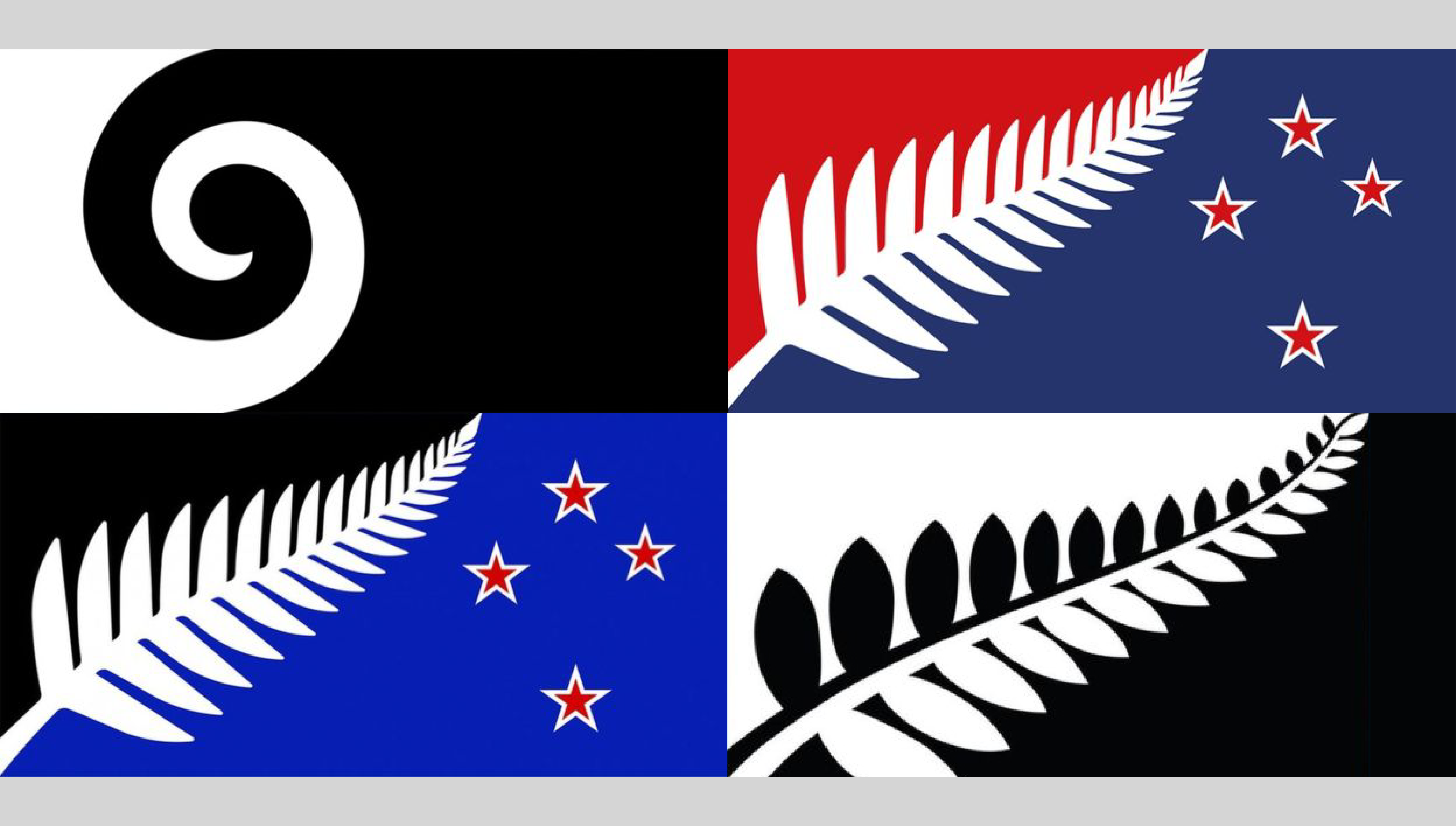
New Zealand flag redesign

The four top candidates for the redesign of the New Zealand flag.

Design as a public trust

There are two design-related stories circulating in recent news that have to do with brands that are “public property.” The first is the logo for the 2020 Olympics in Tokyo. The Olympic games feel like they belong to all of humanity, even if they are sponsored and organized by private entities. The second design project in the public eye is the proposed redesign of the flag of New Zealand, which is clearly a “public” symbol, belonging to the people of New Zealand.

The Tokyo 2020 Olympics logo

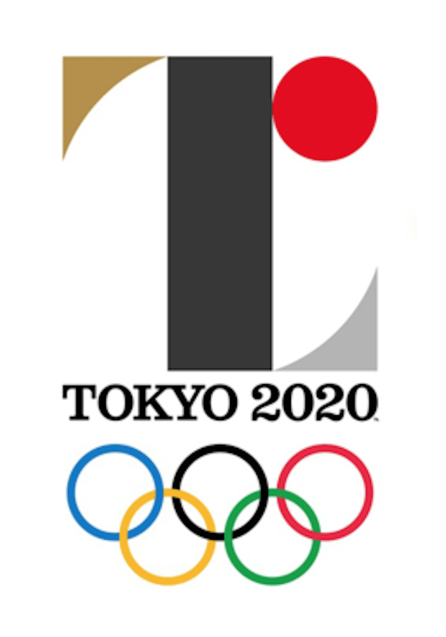
Proposed 2020 Olympics logo

Designer Kenjiro Sano’s original logo for the 2020 Olypmpics

The first story concerns the embattled Tokyo 2020 Olympics logo, which organizers have now decided to scrap. There had already been a fair amount of murmuring when the logo was unveiled, with many people simply disliking it, and some claiming that the mark contained too direct a reference to Japan’s flag. In addition to problems of style and content, almost as soon as the logo was publicly revealed a Belgian designer named Olivier Debie claimed that the proposed logo was a derivative of his own logo design for the Theatre de Liege.

The Belgian designer tweeted this GIF, making his case that the Olympic logo was derived from his own earlier logo design.

The designer of the Olympic logo has denied that the design was plagiarized, and I tend to believe him. There are only so many colors and shapes out there, and there are a lot of designers using them in a multitude of contexts. There has also been some controversy around another project carried out by his firm in which they have admitted copying existing designs, and while that doesn’t help his case I think it’s a red herring. A slipshod approach to a small project for regional consumption is one thing, but I can’t imagine that any designer or firm would be careless (or so brazen) with such a high profile project as the Olympic logo.

But in the end it won’t matter where the image originated–the logo has been abandoned. After the early criticism and the latest accusations of plagiarism the organizers stated, “we have reached a conclusion that it would be only appropriate for us to drop the logo and develop a new emblem. At this point, we have decided that the logo cannot gain public support.”

In most cases a logo design only has to please the few people who are stakeholders in an organization. The designer hopes that to those stakeholders the design reflects the character and identity of the company it represents, but “public support” is not a necessary  benchmark for success. With something like the Olympic games, though, there’s a sense that they belong to the world community and all of us are stakeholders. And good luck pleasing a committee made up of 7 billion members.

A national redesign, or “How to please 3 million clients”

Another very public design debate is swirling around the ongoing development of a new design for New Zealand’s flag. The current kiwi flag has been a contentious issue for some time and has sparked a national conversation. It’s encouraging to me that at least some of the debate focuses on an idea that should be central to every design project: that a design should be evaluated based on what the design supposed to do–does it accomplish what it is supposed to accomplish or does it not accomplish that goal. The authors of nzflag.com, a site that “promotes debate about New Zealand’s national identity and, in particular, about New Zealand’s flag,” write about what they hope to accomplish:

We want all New Zealanders to ask whether the current flag represents our country as we see ourselves today? Can we improve it? Does it portray the image we want to give of New Zealand internationally? Most importantly, does it inspire us?

After reviewing over 10,000 submissions, a government panel shared this gallery of 40 finalists with the public. Predictably, there were many objections that great designs had been overlooked, and when that selection was narrowed to four final designs. (Some of the commentary was mean-spirited, but a much of it was hilarious.)

The designer’s fiduciary responsibility

The reality is that even though they’re entrusted to a handful of decision-makers, both of these symbols are the “property” of millions of people. Inevitably some of those millions of “clients” won’t get what they want. The designer always has a fiduciary responsibility to represent the people and content as well as they are able and to try to accommodate all stakeholders but on projects of this scale, with audiences this large and diverse, it seems like an impossible task. Because a designer’s work will be seen and used by by the whole community, they have a responsibility to create pieces that resonate with and benefit the public, and not just their clients.

Branding, Community, Design, Logo Design

What’s the best font for kids?

I was recently asked what the best font would be for designing material for kids who are learning to read. The truth is that the best font for kids, or for anyone, is always going to depend on the context.

Readability is relative

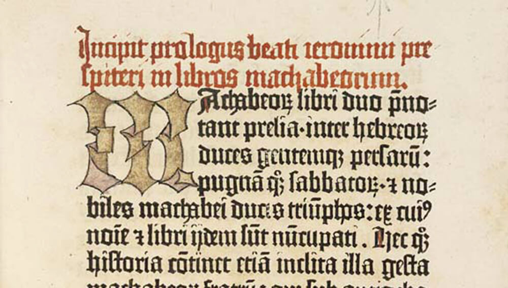
Readability in a font has a lot to do with what the reader is accustomed to reading. When the German printers first started developing moveable type they used the letterforms that reflected how the scribes of the time wrote: Blackletter.

The Gutenberg Bible, (Inc. 1), the National Library of Scotland. Digitized by the HUMI Project, Keio University July 2005. Beautiful, but not the best font for kids.

The Gutenberg Bible, (Inc. 1), the National Library of Scotland. Digitized by the HUMI Project, Keio University July 2005. Beautiful, but not the best font for kids.


For modern eyes, this is nearly unreadable, but to the first readers of Gutenberg’s printed pages in the early 1400’s it was what they were accustomed to read.

Simple letters are best

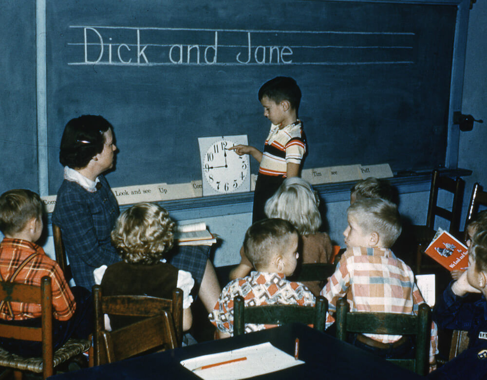
For young readers who are just beginning to recognize letterforms, the best font choice will be something with very few surprises or quirks in the shapes of the letters. Although many people in the design community feel that Helvetica is overused, it might be a good choice for kids precisely because it’s so common. A more classic choice would be Century Schoolbook, the typeface used for the iconic and monumentally boring Dick and Jane books.

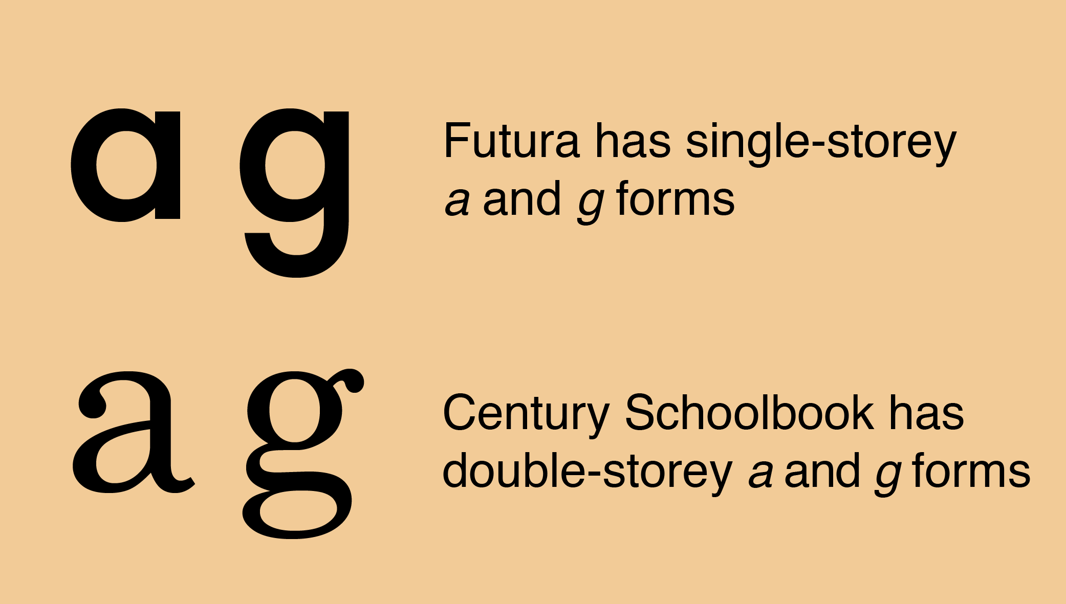
Another consideration is that young readers are also learning to write. The best font for kids might be a typeface that is very close to the letterforms that kids are learning to write. Futura, for example, uses the “one-storey” lowercase “a” and “g” rather than the “double-storey” form, and that might make the text more accessible to kids.

Don’t use all caps

If you’re designing for kids (or anyone, really) you should avoid using all capital letters, since that also hinders reading. (See Clearview–a study in legibility) Uppercase text on the other hand makes every word a rectangle We tend to read word by word, rather than letter by letter, and mixed case text, or text that uses upper- and lower-case letters, gives each word a unique profile that is easier to recognize.

The best fonts for kids aren’t the childish ones

As a final note, I would avoid using “childish” fonts like Comic Sans or a chalkboard font when designing for kids. I don’t say this because of a snobbish view of those fonts–they have their place. Kids learn to talk by imitating, as closely as they are able, proper speech. We shouldn’t use “baby talk” when we’re talking with kids, because we want them to learn to speak well. In the same way, our goal when creating printed materials for kids is to give them a model of how printed letters should look, not to echo back the errors they may already be making.

Book Design, Books, Type Design, Typography

“Some stories run for their lives.”

Some stories run for their lives.

The Queen of Palmyra

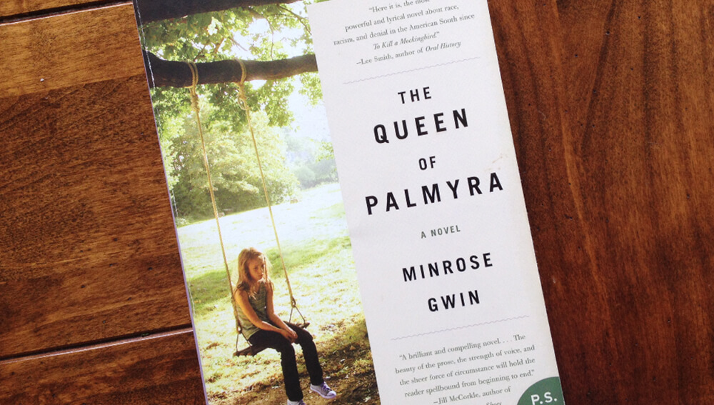
I’ve been reading The Queen of Palmyra by Minrose Gwin the past few weeks. In the book, called “the most powerful and also the most lyrical novel about race, racism, and denial in the American South since To Kill A Mockingbird,” a young girl is caught between her abusive father who is blinded by bigotry and her mother who slowly sinks into her bottles even as she tries to protect the local black population from her husband.

The story is set in Mississippi in the tumultuous summer of 1963. It is the height of the Civil Rights movement and a few months after Dr. Martin Luther King, Jr wrote his Letter from Birmingham Jail.

“He who tells the stories rules the world.”

When I started reading the novel, the time and place it described seemed distant–important, but disconnected from my daily life. Then a few days after I started reading, the shootings took place at the Emanuel African Methodist Episcopal Church in Charleston, South Carolina. The events described in the book suddenly took on new life, new importance. There is power in a story well told, andne of the central themes of the novel is the idea that whoever tells the story gets to define reality. The Hopi people are often credited with a saying: “He who tells the stories rules the world.”

Throughout the book, Gwin interweaves her story with older stories–Br’er Rabbit in the briar patch, the rabbit Uncle Wiggily Longears and his clever but narrow escapes, and stories of the legendary Zenobia, the Queen of Palmyra. The main character drifts in and out of those stories as she lives her own story, and as she decides how she wants it to be told. “He who tells the stories rules the world.”

Some stories run for their lives. They zig and zag, moving so fast you can’t find the secret path of their steps through the fields, only soft prints here and there to let you know something with a quivering heart and soft belly passed that way or this. In what direction it ran or to what end, you will never know. Sometimes you see the blood or fur, and you know it didn’t get away.

Minrose Gwin, The Queen of Palmyra

Hatred and violence in my living room

As I’m finishing the book there are eerie and horrible echoes in the real world. In the novel the little girl’s father comes home late at night smelling of gasoline and smoke. In the news, there are stories of hateful graffiti and arson at black churches around the south. I won’t presume to say that because I’ve read a book I now understand the experience of those who are targets of these barbaric acts, but I will say this–a book like this can give us an emotional connection with people and events that are far off in time and space.

This is why we read books. They give us access to experiences and insight that it would take us many lifetimes to acquire on our own. They open up cultures and worlds that would otherwise be closed. They convey not only information about those distant times and places, but also the emotion and mood of the world they describe. It brings Mississippi of the 1960s and Charleston of today right into my living room and forces me to confront the hatred and violence, the systematic destruction of peoples, and the senseless brutality in our nation’s history.

We can’t change what happened in the past, and we don’t always feel like we have the power to change what is happening today. But we can choose how we tell the stories. In telling true stories about the world that has been, we help to shape the world that will be. “He who tells the stories rules the world.”

Being Human, Books, Community, Ideas

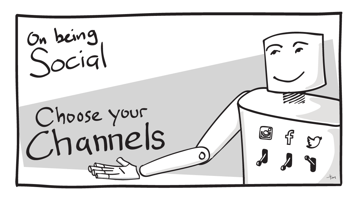
On being social: Choose your channels

This is the second in a series of articles called On Being Social. The goal is to think about how individuals and brands should approach social media in a way that is authentic, healthy and beneficial. I’d love to hear your thoughts on these topics as I’m thinking through them–send me your comments through your social channel of choice or contact me directly.

Mass media vs Personal relationships

There are two general approaches to how people and brands use social media. The first is to broadcast, trying to get as wide a distribution as possible for each piece of content. This is the way people approach traditional media like print, radio, and television.

Social media is a new animal, a hybrid of traditional “broadcast” media and personal relationships.

The second approach to social media is relational–using social channels to know and be known. In the past this type of interaction only happened face-to-face, or in letters and phone calls. The people and brands that understand social media best realize that social media is a new animal, a hybrid of traditional “broadcast” media and personal relationships.

Broadcasting on all frequencies

According to informal surveys I’ve been doing, most people use two or three different social media platforms. Some people connect to each other and brands on only one social media channel but most users connect to the same people on multiple platforms, leading to a lot of duplicate content. This means that if a brand is sending out identical content on each channel, they’re missing an opportunity to add value to their audience. There are times when it makes sense to repeat the same message on every social channel–an event cancellation, for example. Most often, though, your audience will be better served if you create content that is unique to each channel.

Let your audience choose the channel

United: Good use of social media channels

I appreciate it when people create focused, curated streams of content. I like to see what other designers post about design, but I’m not interested in family photos or inside jokes with people I don’t know. The opposite is also true–there are some friends I follow because I want to see their family photos and hear their jokes, but only have a passing interest in their particular industry. If I have the option, I subscribe only to the channels that interest me the most. The same is true for brands.

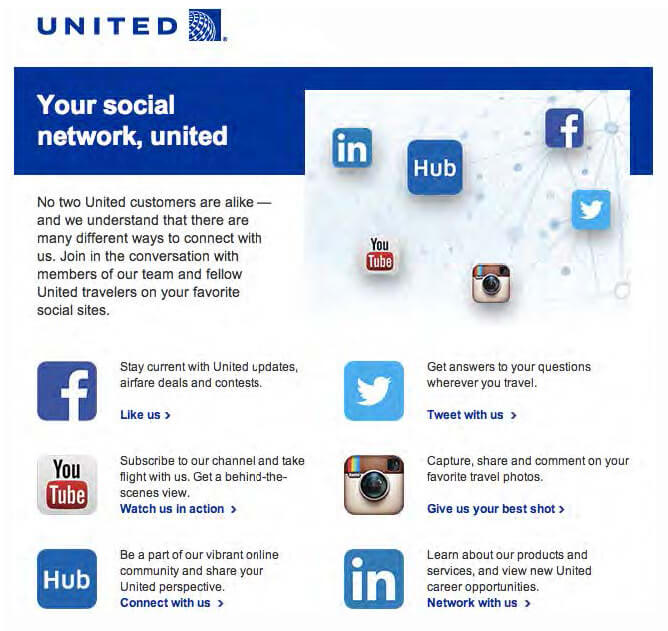
At one point, United Airlines gave a lot of thought to how they structured their social media channels. Each platform had a clear purpose. Because United used each platform in a unique way, it created a focused stream of content in each channel. People could ignore the channels they weren’t interested in, subscribing only to the content they wanted:

Facebook– to send out updates, and to promote deals and contests
YouTube– a behind-the-scenes view
Twitter– specific, targeted travel questions
Instagram– to share travel photos
LinkedIn– to talk about new products and services, and career opportunities

 
Each social channel reinforced the brand, and offered something unique. United customers could subscribe to the channels that were relevant to them, which meant they’d be more likely to find value in the content they received. (Thanks to Matt Bailey of Site Logic for showing me this graphic some time ago.) The benefit for United was that they were able to offer content that was valuable to their audience, and to connect better with the people they were serving.

Saturation vs Service

The mistake that many brands make is that they blast out the same messages on all their social media channels. That assumes that 1) all the channels are the same and interchangeable, and 2) that the people who are in those different social communities are looking for the same types of content in each channel.

In my experience neither one is true. I look on Instagram for beautiful and interesting images, and I don’t expect those images or the communication around them to be time-sensitive. On the other hand the element of time is very important to users of Twitter. Tweets are lightweight and easy to create in a moment, which is why Twitter is many people’s source for up-to-the-minute updates. (Oreo “won the marketing Super Bowl” in 2014 by creating and sending a tweet within minutes of a power outage during the game.) Use each social media channel the way your audience is using it and don’t try to shoehorn in content that doesn’t fit the channel.

If you’re a company or a brand, you should realize that you are a guest at the party–an overwhelming majority of people say they want to use social media to connect with friends and family. Don’t try to saturate your audience with your content. Instead think about how to create channels of content so your audience can find content that’s relevant, interesting, and helpful to them.

In the next article in this series I’ll be exploring an often-overlooked but invaluable function of social media: listening. Again, I’d love to hear your thoughts on these topics as I’m thinking through them–send me your comments through your social channel of choice or contact me directly.

Illustration, On Being Social, Social Media