Paperback

Design studio focused on book design, illustration, and environment design


Say

Hello

On being social: What is social media for?

On being social: Social media as the Handshake Machine

This is the first in a series of articles called On Being Social. The goal is to think about how individuals and brands should approach social media in a way that is authentic, healthy and beneficial. I’d love to hear your thoughts on these topics as I’m thinking through them–send me your comments through your social channel of choice or contact me directly.

What is social media for?

The first email was sent in 1971. Usenet followed in the late 70s and the text-only BBS communities developed through the 80s, users connecting via phone lines and dial-up modems that sounded like this. AIM, Geocities, MySpace and smaller players like Xanga followed in quick succession. (If you’re curious, here’s a timeline of the first 35 years of our online interaction.) A lot has changed over those years and we are still working out how to think about this odd new world.

Living for the audience

Are we becoming a society of people who are “alone together?”

We have been wondering how social media should fit into our lives ever since we first started communicating online. We’ve feared that moving our social interactions to a digital space would create a society of people who are “alone together.” We see each other publishing more and more of the moments and details of our lives, and we wonder if we’re starting to live for the unseen “audience” instead of for ourselves or the people we love. This video (shown below) is a poignant, almost wordless critique of that tendency, while this one shows the darker side of crafting a false image of our lives for public consumption.

What are the rules?

One of the difficulties with our growing use of social media is that we don’t have a clear sense of what the rules should be. There are analogies to be found in the “old” media. The norms and laws that govern print, radio and television apply to social media in some cases, but how we should approach social media individually and as a society is still unknown territory. We are exploring this terra incognita together and making up the rules as we go. What are appropriate things to share? What is a good balance between making connections and preserving privacy? What are the norms and conventions that govern our interactions online? How do we engage in conversations and even debates? How do we grieve together in the face of something like the Charleston Shooting?

And how is it changing us?

Our use of social media is still in flux, and a lot of smart people have given a lot of thought to its effect on us, both individually and as a community. Researchers have noted effects on how we communicate, how children learn and develop, and how we receive and process news, just to name a few. I’m not sure we’ll understand its impact well for another couple generations, but it’s still worth thinking about these larger questions: What is social media for? How should we use it as individuals? And by extension, how should companies and organizations use social media? Should brands play by different rules?

In the next few articles in this series we’ll be looking at some of those questions and their implications for how we connect online. Again, I’d love to hear your thoughts on these topics as I’m thinking through them–send me your comments through your social channel of choice or contact me directly.

Community, Illustration, On Being Social, Social Media

“Hermann Zapf has magic hands”

Palatino, from Anatomy of a Typeface, by Alexander Lawson

Hermann Zapf’s typeface Palatino found a place in Alexander Lawson’s classic Anatomy of a Typeface

Hermann Zapf, a legend in the world of calligraphy and type design, passed away on June 4th, 2015. He was 96.

Many people may associate Mr. Zapf with Zapfino, the elegant script typeface that bears his name, but he created an impressive array of other beautiful and well-known typefaces including Palatino, Optima and hundreds of others. For more on his contribution and images of his work, read this remembrance or this brief biography.

Early career

One of the interesting parts of Mr. Zapf’s career and early success is that he was largely self-taught. After an initial interest in engineering, he was drawn to lettering and calligraphy, and then to type design. Writing about the book that first introduced Zapf’s alphabet designs to the public Alexander Lawson notes:

What is considered remarkable is that this beautiful, classic book was lettered by a man just twenty years of age and self-taught as a calligrapher. Apprenticed at fifteen as color corrector in a lithographic plant, Zapf a year later visited an exhibition of the lettering of Rudolf Koch. He was so much inspired that he immediately purchased supplies and began the experiments that quickly brought him to professional competence. Later he described long hours of practice, when he was frequently admonished by his parents for overuse of the electric lights in the small hours of the night. He sometimes despaired from lack of guidance–discovering, for example, that after three years of effort, he was holding his pen in the wrong position.

Anatomy of a Typeface, p121

“A deep and beautiful mark”

“He picks up a pen and makes a mark with it and it’s a deep and beautiful mark.”

Someone who knew Hermann Zapf and who is more qualified than I am to speak about both his skill and his contribution to the world of typography is Robert Bringhurst, arguably one of the most authoritative voices in the field. Bringhurst’s carefully written and beautifully designed The Elements of Typographic Style is considered the typographer’s bible. In a wide-ranging interview with Type Radio several years ago, he spoke briefly about Hermann Zapf’s depth of skill and his intimacy with the craft of creating letterforms:

I only have to be in the same room with Hermann Zapf for about five seconds before it becomes perfectly obvious to me that he is the sort of person who should be designing type, and I’m the sort of person who should be talking about it. Hermann has magic hands. He picks up a pen and makes a mark with it and it’s a deep and beautiful mark. I don’t have those kinds of hands.

(Robert Bringhurst on Type Radio, 13:00-13:30)

The 1967 documentary below begins with an effortless demonstration by the young Hermann Zapf of the “magic hands” that Bringhurst describes. (Incidentally, in speaking about Hermann Zapf’s talent for designing type, Mr. Bringhurst provides a perfect example of why he himself is “the sort of person who should be talking about it.” Mr. Bringhurst’s first calling is as a poet, and there may be no one who has written as evocatively about typography as he has.)

Although the documentary is a little dated, it’s easy to see a spark of the mind and hands behind Mr. Zapf’s work. I am grateful for his contribution and he will be missed–the world is more beautiful because of Hermann Zapf’s “magic hands.”

Community, Design, Type Design, Typography

My worst client

My worst client
 
There are some clients who are a joy to work with. They have all their material together, a clear idea of the goals of the project, and a definite timeline. They value the designer’s time and sanity, and give clear and constructive feedback in a timely manner.

Then there’s this client. Revision after revision, endless delays, vague feedback. Sometimes projects get put on hold indefinitely, only to be thrown together at the last minute. But what really makes this client my worst client is that he’s always doubting the quality of my work or changing the brief, leading to delays and false starts and missed deadlines.

My worst client

In a perfect world I wouldn’t have to work with this particular client, but it’s complicated–my worst client is me. The projects that I set for myself are sometimes the ones that take the longest and have the messiest process. And since I’m not billing myself an hourly rate, there’s no pressure to be efficient with my time.
Sooo Falls Juggle Poster

Treat yourself like a real client

As a designer, any project I produce for myself takes on a life of its own. Because the deadlines are self-imposed, they don’t have teeth. And because “design is what I do,” I feel a certain amount of pressure to create something not terrible when it’s going to represent me. All of that is great, but a weak, self-imposed deadline combined with a tendency to perfectionism means that my own projects languish on the shelf far longer than a “real client” would tolerate.

A good example is this poster for a weekly juggling gathering I’ve been organizing. I’ve had the poster designed for months, and kept tweaking it and second guessing it. The stakes are clearly not that high–it’s a free gathering for people to juggle in a park. Does the poster really need to be that awesome? I should have just slapped the time and place on there and printed them them weeks ago. They do more good hanging on the walls of the local coffee shops than gathering digital dust on my hard drive. (Although I don’t think that’s a thing.)

Done is better than perfect

The quintessential example of this in (non)action is the fact that for the first year after I started doing freelance design work, I didn’t have a printed business card. I had several good concepts, but there was no deadline and nothing felt sufficiently good enough to print. The result of course was that I would meet with a client to talk about developing branding and print collateral for their business, and then I would scribble my phone number on a napkin at the end of the meeting. Nice. As the Spanish proverb goes, “In the home of the blacksmith, wooden knives.” The reality is that I should have moved forward with one of the concepts that were 90% finished, and revised or reprinted as time allowed. Done is better than perfect.

The point of all this is that you have to treat the projects you do for yourself as seriously as the work you do for your clients, but don’t agonize over the details so much that become your own worst client. Get it designed, get it out there, and move on with your life.

And come out and juggle!

Come juggle with us if you’re in the area! It’s super fun and it’ll relieve all sorts of stress. Follow us on Twitter or Facebook for event updates. I mean, look at these guys–they’re having a great time.

Being Human, Community, Creativity, Design, Layout

WordCamp Minneapolis 2015

Salient thoughts from WordCamp Minneapolis 2015

For the past three years I’ve attended the WordCamp conference in Minneapolis (and have heard and made jokes about “NerdCamp.”) But each year I’ve learned a surprising amount for a one day event. As in the past, the volunteer presenters gave some solid sessions on web design and development, on design in general, information architecture, and even some time dedicated to best practices and making the most of the WordPress platform. Here are some of things that struck me:

Typography on the Web

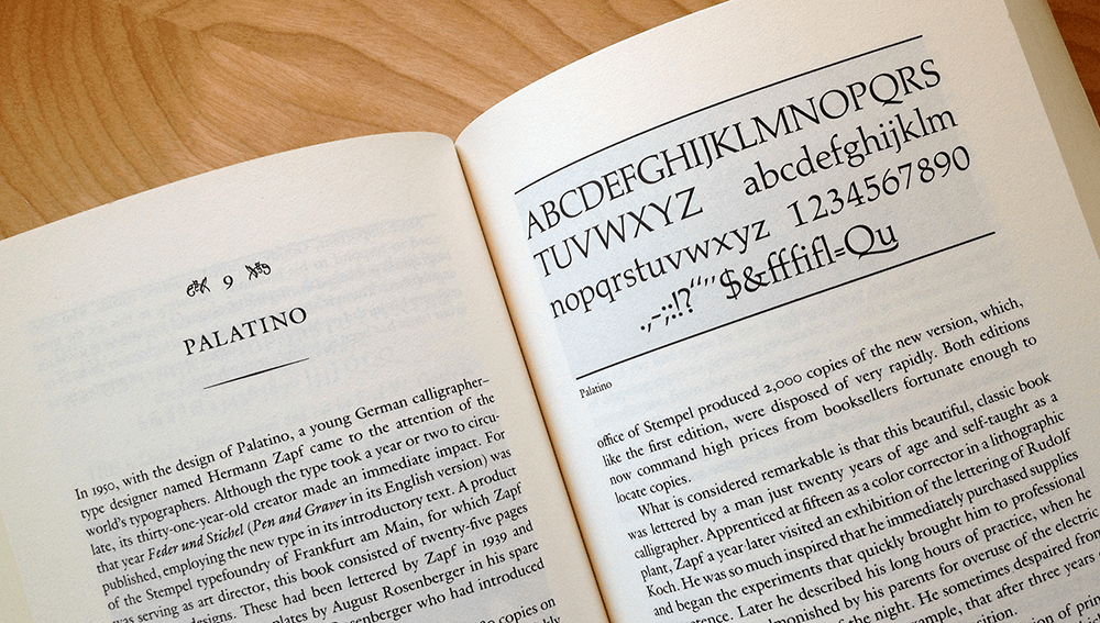
Oliver Reichenstein’s well-known assertion that “web design is 95% typography” is just as valid for most design work, on or off the web. But until recent years, print designers have had access to many more tools than their digital counterparts, and that has made it easier for print designers to follow established typographical practices.

“95% of the information on the web is written language. It is only logical to say that a web designer should get good training in the main discipline of shaping written information, in other words: Typography.”

Oliver Reichenstein

Web designers, meanwhile, have been limited to whatever fonts a user had installed on their computer, and haven’t had the tools to implement many elements of good typographic style. But much of that is changing. Mel Choyce gave a thoughtful look at the current state of typography on the web, including a look down the road to what will come in the next few years: better and more widely available typefaces through webfonts, increasing browser support for responsive type through dedicated JavaScript tools and through viewport units and vw, vh, and vmin, and the myriad possibilities that CSS3 and other tools bring to create dynamic and animated text to the web.

Functionality Plugins

If you’re not into code and, um, science, you can just skip to the next section. But if you like thinking about code, you would really like Josh Leuze, and his talk on functionality plugins. The gist is that instead of packing your functions.php file full of odd bits of code to add functionality to your site’s theme, you should create a plugin that is distinct from your theme files. That allows you to switch on or off (activate or deactivate) that functionality, and it also ensures that if you decide to switch themes you don’t have to copy over all those added code snippets. This modular approach is much easier to maintain, troubleshoot, and if necessary, quarantine.

Complex content vs. Forced Simplicity

One of the most eye-opening sessions for me was Michelle Schulp‘s presentation, Beyond Whitespace: Designing for Complex Content. She argues that in the rush to create simple, minimalist websites, designers have often created a “forced simplicity” that does a disservice to content that is inherently complex.

Everything should be made as simple as possible, but not simpler.

Albert Einstein

Instead of developing a design that presents that complex information well, many times we suppress the content, or bury it on sub-sub-subpages. Michelle quoted Edward Tufte saying, “Clutter and overload are not an attribute of information, they are failures of design. If the information is in chaos, instead fix the design.” I made a note to myself to try to read more Edward Tufte, who has written (and more importantly, thought) a lot about how to present complex information in a way that makes it intuitive and easy to understand. She then outlined a number of strategies for displaying large amounts of complex information in a way that is accessible and not overwhelming, which you can find in her presentation slides.

Speeding up your site

PageSpeed Insights

As you can see I have some work to do on the sites I maintain, including this one.

TinyURL example

Trevan Hetzel of FlyWheel and the Word-Break podcast gave a series of tips on how to speed up the load time of a website. A slow website means lower user engagement, higher bounce rates, and most importantly, a bad user experience. While there are a lot of back end, server-side ways to optimize a site for speed, some of the easiest and most effective improvements involve front end and client-side changes.

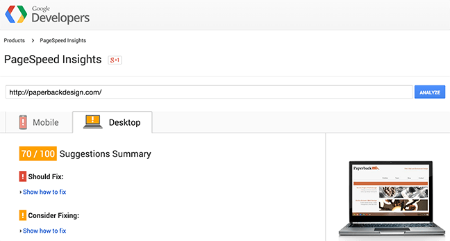
To get a baseline reading on how your site is performing, Trevan recommended using Google’s PageSpeed Insights tool and webpagetest.org. Both of these are free tools that give a snapshot of how your site is currently performing, as well as some recommended steps to take to improve the site’s speed.

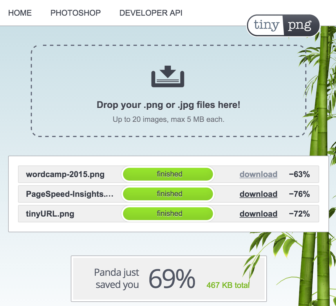
One of the simplest steps to implement involves compressing images using a tool like TinyPNG. (When you loaded this page, for example, TinyURL saved you almost 500kb.) He also recommended serving images at exactly the size the user will see them, so that the browser doesn’t have to do the work to resize them on the fly. (See Trevan’s blog here.)

Only load the code you need: JavaScript and CSS

In order to make your site as lean as possible, make sure you aren’t loading a lot of unnecessary code. Many plugins have a high JavaScript load and you may be able to get similar functionality without the extra weight. Some developers load jQuery as a matter of course, but there are leaner ways. After loading the whole jQuery library, most web projects only use a fraction of the functionality, and often you can use simple “vanilla” JS to acheive the same effects with a much smaller load time. You can also concatenate and minify your JavaScript and CSS in order to serve up much smaller files. Filament Group has a number of tools that can help address some of these issues.

Focus on Perceived Performance

One of the key points of this presentation was that it doesn’t matter (very much) how long it takes for your site to load–the critical metric is rather, How long does it take before the user can begin to use your site? Perceived Performance is how quickly the user is able to do stuff. Focus on loading those parts of the page that are “above the fold” so that the user is immediately able to begin to do the things that made them want to visit your site in the first place. If the advanced functionality of the page loads while they’re reading the introductory text, no problem. But if they stare at blank space until every last scrap of code is loaded, they may not still be there when that welcome text pops up.

There are a number of other ways to streamline the speed, and more importantly the user experience, of your site that won’t fit in this limited summary. You can see the slides for the presentation on how to speed up your site here.

Content First Design – Why not to design with lorem ipsum

Travis Totz of WerkPress gave an intriguing talk about the importance of beginning your process with content rather than with design. There is often pressure from clients or project managers to start building the design using temporary filler content, and to replace that temporary content later with the real content.

Filler content always conveniently fits your design but the final content probably won’t.

One problem with filler content is that it always conveniently fits your design but the final content probably won’t, which means revisions and a slower process. (In my mind, a more serious problem with designing without the final content is this: the design should be a natural outgrowth of the content, so if you design with generic content you will inevitably create a more generic design. You can’t support content that you don’t have.) Another motivation Travis mentioned for focusing on the content first is that Google doesn’t care about how your site looks. Google only indexes the content, so creating quality content should be a top priority for everyone involved.

For more on the problems of designing without content, read Lorem Ipsum is Killing Your Designs by Kyle Fiedler (2010) and Why you need a good design brief.


Thanks to the volunteers, sponsors and speakers for putting on a quality (and affordable) event for designers and developers in this area. On a related note, I’d love to start organizing something like this in the Sioux Falls area. If you’re interested in being a part of planning or participating in something like a WordCamp, let me know.

Community, Design, The Nerdatorium, Typography, Web design

Day of the Book #shelfie

A #shelfie of the books we’re reading in our house–some for me, and some for the kiddos.

The International Day of the Book

The 23rd of April is celebrated in many places as the International Day of the Book, or World Book Day. UNESCO declared April 23 to be World Book and Copyright Day as “an opportunity to recognize the power of books to change our lives for the better and to support books and those who produce them.”

April 23rd has grown in importance in the world of letters due to a number of important events happening on or near that date. In 1616 William Shakespeare died on the 23rd and another great literary light, Miguel de Cervantes, is thought to have been buried on the same day of the same year.

La Diada de Sant Jordi

The 23rd of April is an especially important day in my second home–Barcelona, Catalonia. Since 1456 the Catalans have celebrated La Diada de Sant Jordi, or the Day of St. George, on this day. Sant Jordi is similar to St. Valentine’s Day– it is tradition for women to receive red roses, and men to receive books. The most celebrated Catalan language literary festival, the Jocs Florals, or The Floral Games, are also held on the 23rd.

Read a book, take a #shelfie

I’m not a big fan of the selfie–I think it may be one of the more troubling trends of our age. We take a lot of selfies. Whether you’re a fan or not, it’s hard to deny that the selfie tends to make us more concerned with our faces than our minds. The selfie makes us more and more focused on our “self,” and causes us to pay more attention to how we seem rather than how we are.

Books on the other hand focus our attention outside ourselves, pointing us to experiences and people and ideas that are different and alien to ourselves. I’d much rather see a photo of the books my friends are reading than see another selfie. So in honor of the Day of the Book, read some books! And send me a #shelfie.*

*(I recognize there’s a certain irony in championing the #shelfie–it’s just as likely that we’ll carefully craft our public images by choosing the books we show, etc.)


Another view on selfies

A friend reminded me that there can be a more nuanced view of the selfie. This article by The Guardian includes an interesting counterpoint, saying that “A selfie can, in some respects, be a more authentic representation of beauty than other media images.” It goes on to quote an article for Psychology Today:

Instagram (and other social media) has allowed the public to reclaim photography as a source of empowerment… [it] offers a quiet resistance to the barrage of perfect images that we face each day. Rather than being bombarded with those creations… we can look through our Instagram feed and see images of real people – with beautiful diversity.

Instagram also allows us the opportunity to see below the surface. We capture a glimpse into the makings of people’s daily lives. We get a sense of those things that make the everyday extraordinary.

It’s undoubtedly too simplistic to lump all selfies into one category. Thanks for the good perspective, SZ.

Book Design, Books, Community, Ideas, Social Media, Travel