Paperback

Design studio focused on book design, illustration, and environment design


Say

Hello

Typography and National Security

There are some situations where it’s acceptable to write entirely in capital letters.  Headlines, titles, epitaphs carved in marble–when the text is brief and when you intend to emphasize a specific word or set of words.  But in general, as a matter of good typography and style, writing in all caps should be avoided.  Lowercase letters make text much more readable.

But don’t take my word for it–ask the US Navy.

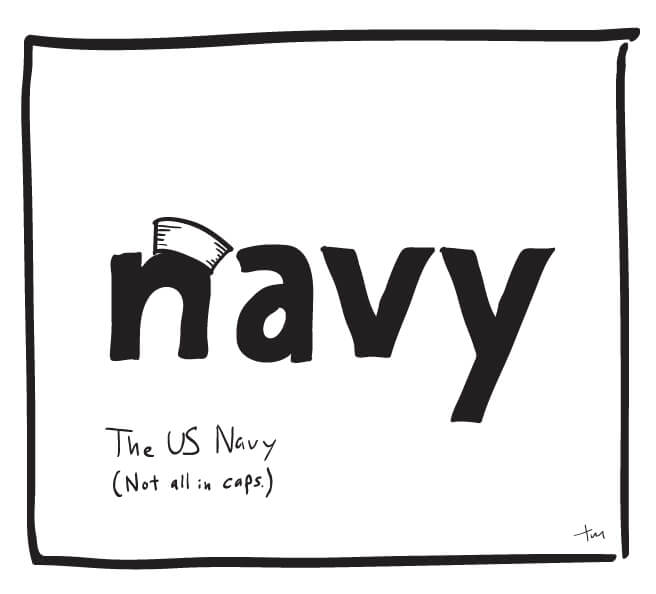
US Navy–Not all in caps

The US Navy recently sent out a message (written in all caps, according to the BBC) to the effect that official communications can soon be written and sent in a mixture of capital and lowercase letters.  Throughout its history, all US naval messages were sent in capital letters.  This was due in part to the technical limitations of some early communications systems and in part to tradition.

But the Navy is now ready to take a step toward better typography, and one of the primary reasons is that lowercase letters significantly enhance readability.  In the official press release last week, James McCarty (naval messaging program manager at U.S. Fleet Cyber Command) is quoted as saying “Lowercase messages are here to stay; they provide a more readable format.”

Plus it’s just bad manners to write in all caps–no one likes to be shouted at. Writing in a mixture of cases is more legible and more expressive, allowing the writer or designer to use the nuances of the written form of our language to dynamically communicate, instead of writing in one loud, monotonous voice.

Design, Typography

Cafeto Colombian Coffee

Cafeto, Coaster

One of our clients, Cafeto Colombian Coffee is now selling fair trade, organic Colombian coffee at the 8th and Railroad Farmer’s market, every Saturday through September.

Cafeto Colombian Coffee was founded by political refugees from Colombia. They source their coffee from fair trade organic Colombian growers and have it roasted to their specifications.

Through their business Cafeto works to improve the lives of those in northern Colombia who have been affected by the conflict there, and part of the proceeds go to support the Lizwan Leadership and Development Foundation. (Read more about both on their website.)

Cafeto was also recently featured in this article.

client news, Logo Design, Photography

The Graveyard of Good Ideas

The Graveyard of Good Ideas

Years ago I read in the preface of a collection of a photographer’s work about a book that was impossible to make.  The book he was describing would never exist because it was a collection of  images that had never been created.  This photographer (whose name I’ve forgotten) was referring to the missed images–the moment when a spectator walked in front of the lens, the moment his finger missed the button, the moment just before the picture was taken, or just after.  The idea intrigued me enough that it’s stayed in my mind ever since.

I have a similar body of work.  In the process of creating logos, or layout projects, or web designs, a lot of decent material hits the cutting room floor and is never seen by anyone. In a logo design, for example, we create a series of initial concepts, and a small selection of the ideas generated are shown to the client.  The client identifies one or two as possibilities, and then we refine those further.  The final logo is chosen and the art is finalized.

What do you do with the good ideas no one wants?

The process works well, but at each phase a lot of good ideas are discarded.  The question is what to do with those good ideas?  Some of the general ideas may apply to other projects, but if we’ve done our job well, those concepts and design solutions are unique to that client’s situation.

Unlike the collection of the photographer I mentioned earlier, the ideas in this collection aren’t lost–they’re on my hard drive gathering digital dust.  It’s hard to imagine a context where that collection might be displayed.  Most clients would not like to have a handful of alternate, non-approved design pieces floating around with their names on it.  Because the concepts are inextricably bound up with the names and identities of the organizations they were created for, it’s impossible to make them anonymous without destroying the idea.

I’ve thought about ways to present this collection in the future, either on our site or in print, but for now our graveyard of good ideas is closed to the public.

(If anyone knows who this photographer is, please let me know.)

Creativity, Design, Ideas, Illustration, Logo Design

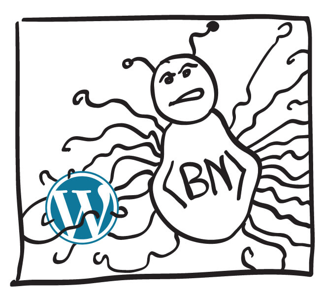
Huge botnet attack on WordPress!

Botnet vs. WordPress

Sounds like science fiction, doesn’t it?

Not so fictional, according to the BBC.

Nearly 17% of websites around the world run on the WordPress platform (including this one.) It it one of the most accessible and flexible content management systems available, which has made it a popular choice for a wide range of businesses and organizations. That degree of popularity also makes it an appealing target for botnet operators. Because the underlying structure is the same for all these different sites, a hacker who manages to exploit a possible vulnerability in that structure may be able to apply that same technique to any the 64 million sites that run WordPress.

In this case, the attack is relatively straightforward–the default user name on most sites is “admin” and this botnet simply tries thousands of password combinations with that user name until one of them gets through. An easy fix is to change your password to something other than the default password. An even better fix? Delete the “admin” user altogether.

Later this month, I’ll be attending (along with several of these fine gentlemen) Wordcamp Minneapolis, a conference designed to strengthen and educate the community of WordPress developers and users in this area. One of the many sessions I’m looking forward to is the area of WordPress security. I’ll tell you as much as you can stand to hear about it when I get back.

Design, Web design

Designing Brand Identity

Creating a brand identity is often limited to developing a logo, defining a color palette, and choosing a typeface or two.  These elements will go a long way to give an organization a unique look and feel, but often that unique look and feel could just as easily be applied to other similar organizations, or even companies in entirely different industries.

This design for Orchestre Symphonique Genevois is much more complete.

Logo for Orchestre Symphonique Genevois

Beginning with the logo design, they created a custom display typeface that incorporated musical notes.  That custom typeface is used in all collateral material, giving the Orchestre Symphonique Genevois a unique voice that is recognizable even after reading only a handful of words. From the typeface and logo design, they created grids and layout guides that unify all their materials.

To enhance the connection between the form and the content of their message, they created a system of translating a line of text into a melody.   That system was used to develop web and smartphone apps that allowed users to send and receive text messages accompanied by the melodies that were dynamically created by the message itself.

I love everything about this. Custom typeface design, using the available media to its full capacity, an identity that is inextricably bound up with the organization it represents–I’m glad that this was made. (You can also watch the video here.)

The most powerful thing about this identity design is that it grows organically from the values and activities of the organization it represents.  These elements cannot be “reskinned” to promote an athletic shoe or a cell phone carrier–they are a natural extension of the Orchestre Symphonique Genevois.

Branding, Identity, Logo Design, Type Design