Paperback

Design studio focused on book design, illustration, and environment design


Say

Hello

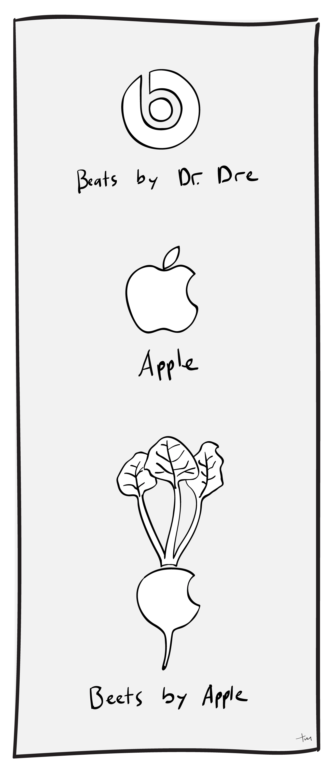
Beats by Dr. Dre, Beets by Apple

Beets by Apple

Just for fun, here’s a new logo concept for Apple’s recent acquisition of Beats by Dr. Dre, “Beets by Apple.”

The $3.2 billion deal was announced last week, and is Apple’s largest investment to date.

It’s harder to draw a recognizable beet than I thought it would be.

Illustration, Logo Design

“It’s ok to look back and cringe.”

Not my best work

One of the cold hard facts of the creative life is that we all have some past work that we’re not proud of. We’ve all put our names on projects in the past (maybe not even the very distant past) that we now hope will be forgotten. Sometimes the most painful part of seeing old projects is remembering how much I liked them at the time. That introspective regret is probably a common experience in any line of work, but in creative work it can be especially discouraging.

“It’s ok to look back and cringe.”

“It’s okay to look back and cringe. As creatives, if you aren’t looking back and cringing you aren’t getting better.”
-@SusanGKoge via @99u

A few days ago, I saw this quotation from a talk by Susan Gregg Koger, Founder & Chief Creative Officer of ModCloth. She was speaking at the 99u conference and what she said made an impression on a number of people, for good reason: It’s a refreshing reminder that all of us are in process.

As we develop, we’ll have good reason to critique the work of our younger selves. The work that we’re not happy with might not disappear as quickly as we’d like, but there’s no reason to lament that. If your goal is to have a perfect record, you’re not going to do much–you’ll be too scared to try things. The only reason to think about what you don’t like in your old projects is to do something different in your new projects. Looking in the rearview mirror is useful at times, but it’s a bad way to drive.

Focusing on the creative act, not the final product

Focusing on the creative act

Our interns (5 and 3 years old) create a prodigious amount of artwork. My sweet five-year-old girl loves coloring and has recently added mixed media to her portfolio, cutting and gluing things together in all manner of combinations. Some things she has made we’ve kept for years, and it’s interesting to see her find them again. She turns them around, half-remembering the crayon lines and bits of paper. Even more interesting is that she doesn’t linger on those old pieces very long. She’s too young to be embarrassed about the past, and usually too busy making her current project to give it much thought. She’s more engaged in the creative act, and less worried about the final products.

The reality is that there will be lots of “final” products, and some of them will be cringe-worthy when you see them again in a year or five years. Take those cringing moments as a sign that your taste is being refined, and your design sensibilities are being sharpened, and move on. There’s a lot more work to do.

Creativity, Design

The authenticity of human error

We are drawn to things that we know have been handled and shaped by human hands. We sense that those things have taken time to craft, and they feel more valuable.

“That human quality is what attracts me to it. Those imperfections, mistakes–that’s interesting.”

Even if there are imperfections, we prefer our mom’s lumpy chocolate chip cookies over the machine-shaped precise circles that come out of the package. (Sorry, mom–they’re not that lumpy.) Because we know they have been created by a person, rather than a process, they feel more authentic.

The Sign Painter


The Sign Painter is a short film by Dress Code that celebrates the value of a skilled craftsman, and the human quality of a hand-painted sign. Mike Langley describes how the sign will fade and weather, and the brush strokes that went into each shape will slowly come out, revealing the human hand behind those shapes. “That human quality is what attracts me to it,” he says. “Those imperfections, mistakes–that’s interesting.”

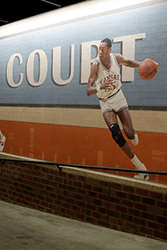
NBA Ramp Mural, Sanford Pentagon

Adding some endearing human error

I tried to recreate that effect in a recent mural project, although I was building the artwork in a digital space. For this particular mural, I was trying to recreate the human feel of a 1950’s-era hand-painted sign, but everything I put together looked too crisp and precise–too digital. It looked artificially perfect, because there was no human error. I tried to apply various image filters and effects, but none of them had the same human feel.
Handpainted human error, NBA Ramp Mural, Sanford Pentagon
In the end, I digitally repainted the lettering in an attempt to evoke a sense of the human touch–to intentionally introduce some human “error” into the overall composition. In the final installation, it makes a subtle but valuable contribution to the mood and tone of the piece.

It’s hard to wander around and explore the landscape if you’re a train on a track.

Too often if I start my design process directly on the screen, using the tools available in the digital world, my work comes out looking very flat and generic. It lacks the human touch. My layouts come out blocky, in predictable boxes and columns. My illustrations all look very geometrical and machine-made. In a sense, that’s an authentic expression of the digital process, but it’s not usually very interesting. It’s the product of a linear process, and there’s not much room for “human error” to get in. It’s hard to wander around and explore the landscape if you’re a train on a track. I fall into the trap of thinking that it will be faster to start that way, but it usually takes longer to develop a project started on the screen into something that I’m happy with.

Sketch it out

When I start by sketching on paper, my lines tend to be a lot more free and expressive. The finished designs are warmer and more human, and frankly a lot more interesting. (A great example of this method in action is in the work of the women of 1canoe2–they open up their creative process and show viewers how the magic happens.) The end result of this kind of process is an organic, accessible design that feels more authentic.

As a final note, I like how the closing shot of The Sign Painter pairs the motion of the coffee roaster’s cooling tray stirring the beans with the sound of brushes on the snare drum. I don’t know if that’s intentional, but I hope it is. The messy physicality of both is a good reminder of where the magic comes in.

Creativity, Design, Illustration

Creative Momentum, Muses and Terrible Ideas

The process of working through bad ideas is what makes good ideas possible.

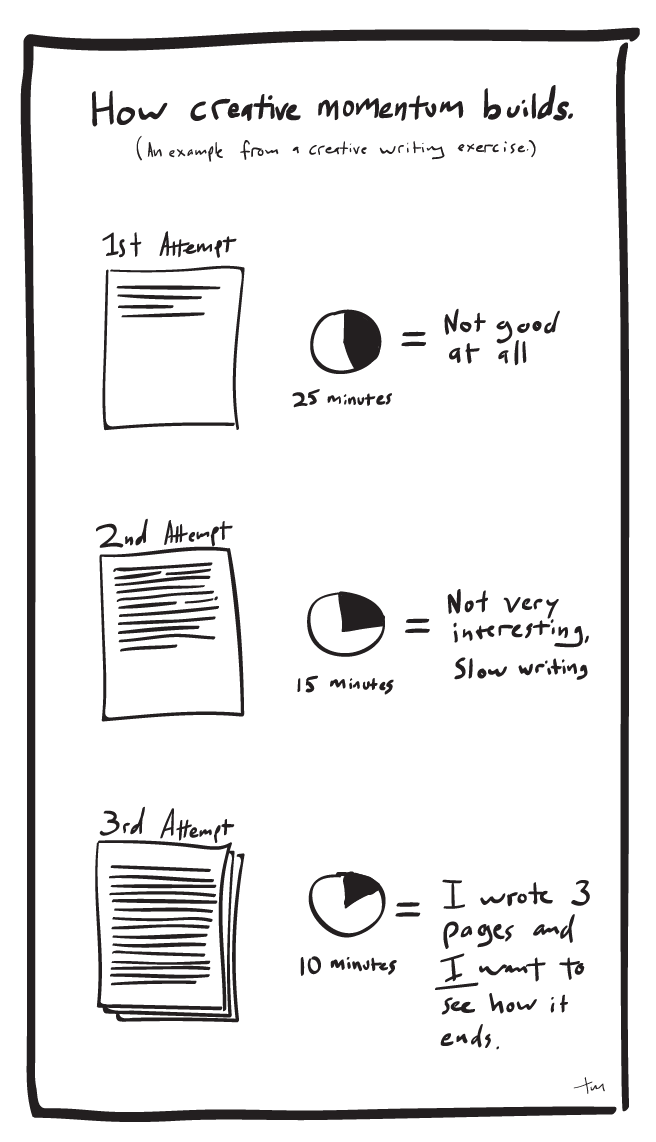
My first ideas are usually terrible.

My next ideas are a little bit less terrible, but still not great. Worse still, it takes me a relatively long time to develop those first not-great ideas. But those first attempts aren’t a waste of time, because working through bad ideas is what makes good ideas possible.

It’s a common experience for anyone doing creative work, and I imagine that the same is true in a lot of professions. Friends who are writers tell me that the first few paragraphs, or even the first few pages of a project, are sometimes painfully slow and that the early ideas are often difficult, stunted false starts. Much of the early material gets thrown out along the way, but those initial faltering steps are the only way to get to the finished product.

Creative Momentum

“Sing in me, O Muse…”

Once the creative momentum has started, the work flows more easily and naturally. It can feel like the ideas have a life of their own. It’s easy to see how the Greeks spoke of the Muses–how it seemed to them that their ideas were coming, fully formed, from some outside source. Homer starts the Odyssey by saying, “Sing in me, O Muse–through me tell the story…” We get caught up by the momentum of the work and it carries us along (almost) effortlessly.

Part of the creative process

My sketchbook is full of abandoned layout concepts, half-finished logo ideas, and doodles and scribbles that will never be seen by the client. But most of my finished projects can be traced back to one of those sketches. They weren’t the product of wasted time or effort–they were a part of the process, and an indispensable step along the way. The only way to get to the good ideas is to work through the bad ones.

Creativity, Ideas, The Nerdatorium

Should you do freelance design work?

A friend asked me a few days ago about the pros and cons of doing freelance design work along with your primary design job. Even though I approach the question as it relates to my work as a graphic designer, I think there are general principles here that apply to any profession.

The biggest benefits to pursuing side projects that I see relate to the variety of work. Along with my freelance work, I get to work with this solid group of people at MJM, and I’m fortunate that there’s a lot of variety even within MJM. (MJM spends about half its energy and time working for non-profit clients, and about half working with clients in vision care and related fields.) The more I thought about the pros and cons of working on outside projects as well, the more benefits I saw.

Working with a variety of clients, and therefore a variety of styles and voices, is one of the best ways to keep your mind and your fingers nimble. It may be the only way.

Everyone wins

A broad range of work is good for everyone involved.

Your clients (all of them) get work that is more sophisticated, informed by a wide range of past projects. When a designer works in one brand or one voice for a number of years, it’s easy to let everything have that flavor. On the other hand, if a designer is regularly working in several contexts, it’ll be much harder to fall into a creative rut.

But clients aren’t the only ones to benefit. Your employers will find themselves working with a designer who is much more versatile, able to adapt his or her style with an agility developed by constant practice.

The designer may be the one who benefits most in the long run, in plain quality of life. None of us wanted to work in a creative field so that we could churn out the same work day after day. Working with a variety of clients, and therefore a variety of styles and voices, is one of the best ways to keep your mind and your fingers nimble. It may be the only way.

Access to a wide variety of styles

Working in a wide variety of projects give you access to a wide variety of styles and voices.

designers-toolboxAlong with our non-profit clients, MJM works with a number of organizations related to health care. The danger with health care design is that a lot of design in the industry ends up looking pretty similar. A lot of white space, clean, sparse layouts, blues and greens, nothing edgy or alarming (a lot like the interior of most hospitals, actually.) The value of having my hands in a lot of different projects is that each project influences and shapes the others. When I start designing a brochure for an eye care clinic, I may have just spent the morning developing a website for a non-profit, or laying out spreads for a cookbook. It’s likely, and I think beneficial, that elements of those projects will inform the clinic brochure. The clinic brochure will tend to be a warmer, more human, and more accessible piece than it would have been if I’d spent the morning designing other pieces for the health care industry.

The same principle applies in the opposite direction. When I’m working on the website for the non-profit, I’ll be able to selectively apply some of the tone and visual language of the clinic brochure, helping to give the non-profit a credible, trustworthy voice. Even though the aesthetic might be less formal, the information still needs to be well-organized and easy to follow, and I can also draw from the tools that I used in the clinic brochure to do that.

Renaissance men and polymaths

Working in a variety of fields helps give you a broader understanding of each field.

Having worked on a variety of projects in various fields, I have a toolbox full of strategies and styles to choose from.

Part of our role as designers is to organize and present information in ways that are accessible to a wide audience. We’re not generally designing for other designers, or even for other people in our same demographic. To be successful, my eye clinic brochure needs to be equally accessible to a 20-something college student, a 55-year-old farmer, or a 35-year-old IT worker. Having worked on a variety of projects in various fields, I have a toolbox full of strategies and styles to choose from. But working on that wide variety of projects has also given me the opportunity to learn a lot about a range of topics.

In the spirit of the ideal Renaissance Man, a broad range of knowledge and experience makes it possible to make connections that might otherwise be missed. (Leonardo da Vinci was a painter, but also a sculptor, architect, mathematician, inventor, engineers, etc.) When we know and understand more, we are better teachers, and we’re better equipped to present information to our audiences.

The dangers

There are some dangers, of course. There’s a limit to how much you can keep track of in the one head you have, and the more clients and projects you have, there is always the increased chance of losing the thread on a particular project. There is also the potential for the occasional conflict of interest between your primary job and a freelance client, or odd political situations to be aware of, but an open line of communication between all parties and an ongoing dialogue with co-workers should avoid or defuse those situations.

––

Moving back and forth between several styles and voices allows a sort of cross-pollination between those projects. That interchange of creative ideas gives me as the designer ready access to more options than I would have had otherwise. (And often speeds up the process, which is always a welcome thing.)

If nothing else, your freelance design projects are a place to explore new ideas and learn new skills without asking permission or risking the credibility of the agency you work for.

Creativity, Design