The authenticity of human error
We are drawn to things that we know have been handled and shaped by human hands. We sense that those things have taken time to craft, and they feel more valuable.
“That human quality is what attracts me to it. Those imperfections, mistakes–that’s interesting.”
Even if there are imperfections, we prefer our mom’s lumpy chocolate chip cookies over the machine-shaped precise circles that come out of the package. (Sorry, mom–they’re not that lumpy.) Because we know they have been created by a person, rather than a process, they feel more authentic.
The Sign Painter
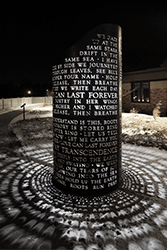
The Sign Painter is a short film by Dress Code that celebrates the value of a skilled craftsman, and the human quality of a hand-painted sign. Mike Langley describes how the sign will fade and weather, and the brush strokes that went into each shape will slowly come out, revealing the human hand behind those shapes. “That human quality is what attracts me to it,” he says. “Those imperfections, mistakes–that’s interesting.”
Adding some endearing human error
I tried to recreate that effect in a recent mural project, although I was building the artwork in a digital space. For this particular mural, I was trying to recreate the human feel of a 1950’s-era hand-painted sign, but everything I put together looked too crisp and precise–too digital. It looked artificially perfect, because there was no human error. I tried to apply various image filters and effects, but none of them had the same human feel.

In the end, I digitally repainted the lettering in an attempt to evoke a sense of the human touch–to intentionally introduce some human “error” into the overall composition. In the final installation, it makes a subtle but valuable contribution to the mood and tone of the piece.
It’s hard to wander around and explore the landscape if you’re a train on a track.
Too often if I start my design process directly on the screen, using the tools available in the digital world, my work comes out looking very flat and generic. It lacks the human touch. My layouts come out blocky, in predictable boxes and columns. My illustrations all look very geometrical and machine-made. In a sense, that’s an authentic expression of the digital process, but it’s not usually very interesting. It’s the product of a linear process, and there’s not much room for “human error” to get in. It’s hard to wander around and explore the landscape if you’re a train on a track. I fall into the trap of thinking that it will be faster to start that way, but it usually takes longer to develop a project started on the screen into something that I’m happy with.
Sketch it out
When I start by sketching on paper, my lines tend to be a lot more free and expressive. The finished designs are warmer and more human, and frankly a lot more interesting. (A great example of this method in action is in the work of the women of 1canoe2–they open up their creative process and show viewers how the magic happens.) The end result of this kind of process is an organic, accessible design that feels more authentic.
As a final note, I like how the closing shot of The Sign Painter pairs the motion of the coffee roaster’s cooling tray stirring the beans with the sound of brushes on the snare drum. I don’t know if that’s intentional, but I hope it is. The messy physicality of both is a good reminder of where the magic comes in.
To read more articles like this visit: Creativity, Design, Illustration