Typography for Kids – Bembo’s Zoo, The Clothes Letters Wear, Hyperactivitypography
As a parent teaching my kids about letters, it’s sometimes difficult to know which A to focus on. What is the Platonic form of the lowercase A? It may also be an occupational hazard that I want to tell them about serifs and italics and the difference between a two-story “a” and a one-story “a.” And I’m not alone. Here are several books that have been put together with the aim of teach children more about the various and sundry shapes that our letters can take.
Bembo is a typeface that was developed in 1929, but was based on the print in a 1495 work from called De Aetna. The De Aetna type, as it is called, was cut by Francesco Griffo for a printer named Aldus Manutius in Venice. The modern typeface was named after Pietro Bembo, an Italian poet who wrote a short book about a journey to Mount Aetna. (That text was the original purpose of the De Aetna typeface.)
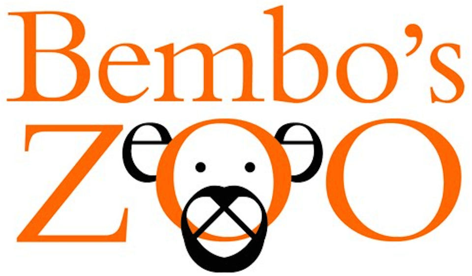
Bembo has been very popular for setting books and long texts since the 1930s, but more recently it was the inspiration for a children’s book, Bembo’s Zoo, by Roberto de Vicq de Cumptich. The author creates a zoo-ful of animals out of the letterforms of the Bembo font.
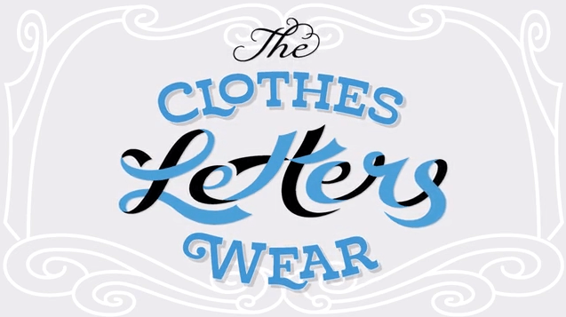
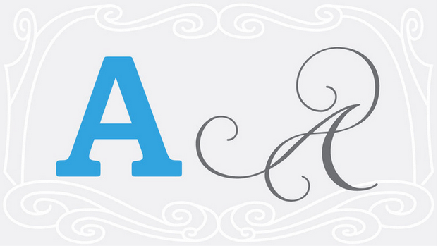
An even more recent project is The Clothes Letters Wear, by Jeremy Dooley. It’s a straightforward trip through the alphabet, but each letter is taken as an opportunity to explain and explore the myriad forms of letters. That project should be available to purchase within the next few months.
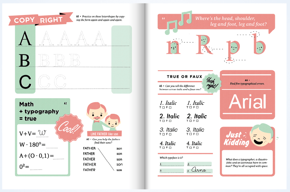
One more resource that teaches children about letters, typography and letterforms is a book called Hyperactivitypography from A to Z by Studio 3. The book looks fantastic, although I have yet to see the printed version–that link will lead you to the Studio 3 project page and the book itself is available in a number of online stores.
To read more articles like this visit: Book Design, Books, Community, Design, For EMM, Type Design, Typography

