Paperback

Design studio focused on book design, illustration, and environment design


Say

Hello

Sanford Fieldhouse Mural

Sanford Fieldhouse Mural

The new Sanford Fieldhouse will officially open later this week.  According to the Sioux Falls Business Journal article,

The 85,000-square-foot building will support local, regional and national athletic training, co-ed sports leagues and Sanford’s Power programs. The Fieldhouse will offer athletic performance development; comprehensive functional, physiological and biomechanical evaluations; and rehabilitation and nutritional consultation services.

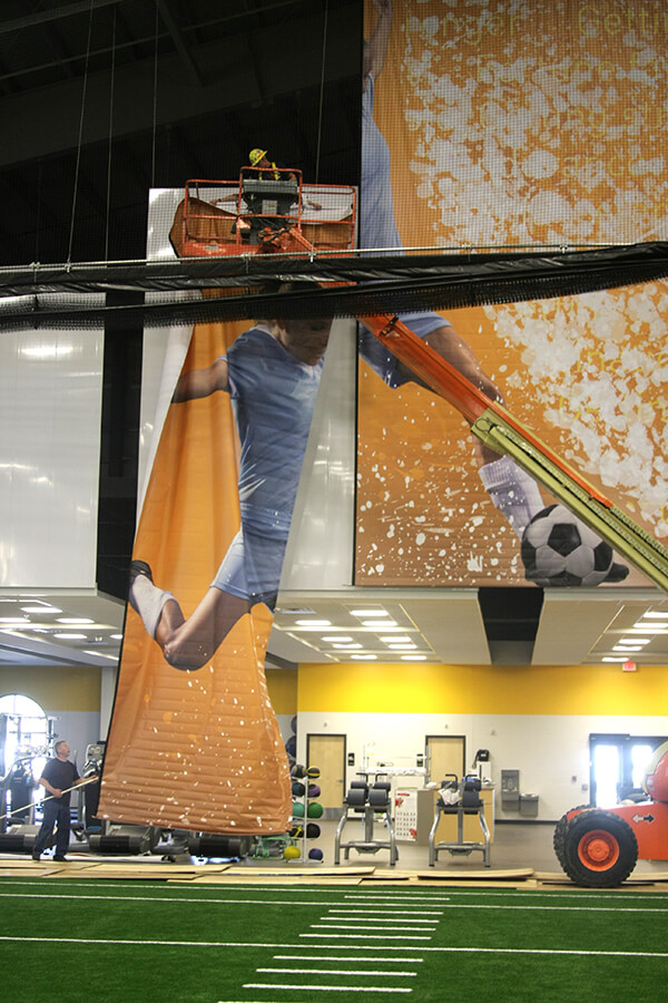
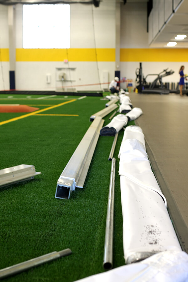
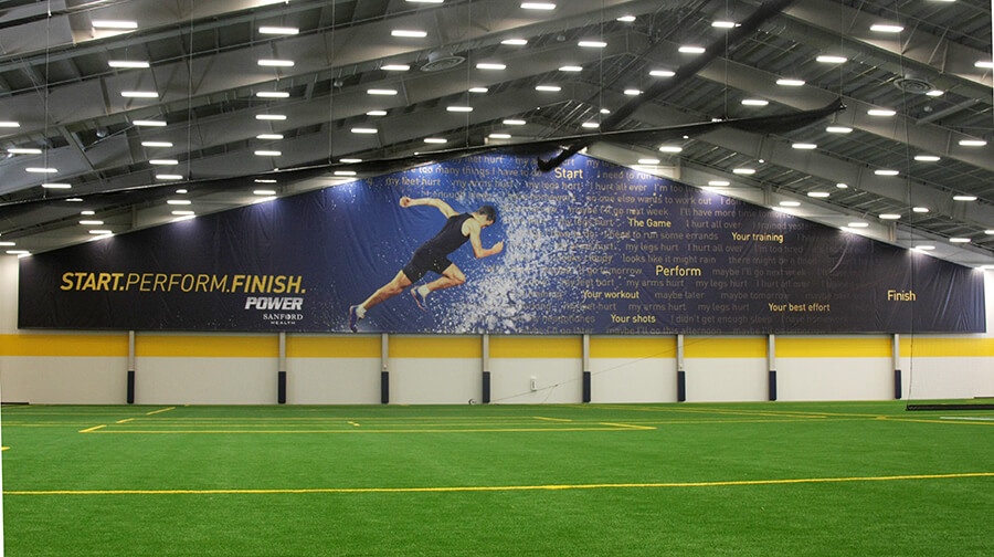
It is also home to two large-scale murals that we designed.  These photographs, taken during the murals’ installation, give a sense of the scale.  The photo on the left shows the frame the murals hang from, and the rolled sections of our soccer player mural.

Each Sanford Fieldhouse mural shows an athlete in training, the athletes pushing through a thick cloud of excuses not to train. Our designs, shown below, were printed and installed by Heritage Art, Ltd.

Community, Design, Ideas, Illustration

Good Design or Lots of Signs

Raise your hand if you’ve ever walked up to a door and pulled, only to find out that it was a “PUSH” door. To make matters worse, as you were fruitlessly pulling on the handle, your wandering eyes fastened on the sign that read, “PUSH.” You’ve been a victim of bad design.

When you or I walk into a coffee shop, or a bank, or a movie theatre, we do not read signs. Generally speaking, if I enter a coffee shop and see someone standing behind the counter, I walk up to them and order a mug of whatever light roast coffee they have, with a little room, please. I won’t have noticed the large sign saying that I should walk to the end of the counter and place my order with the person at the register behind the bakery case. I could walk by five such signs without reading them, because I think I understand the situation and protocol already.

We don’t read signs—we take cues. We navigate most of life by subconsciously reading the situations we find ourselves in and acting on the cues those situations present. We only read signs when the situation is unclear. When we go to a new restaurant, and we’re not sure if we order at the counter or sit at the table, the restaurant has already failed to guide us with cues. The sign that reads, “Please wait to be seated” is a tacit admission that the cues have failed, and that many un-cued patrons have wandered in and seated themselves.

A “PULL” handle on a door is a cue to pull. A line of velvet ropes is a cue to line up. (A cue to queue, if I may.) A floor mat that leads from the door to the counter is a cue to order my coffee where the carpet stops. In future posts, we’ll discuss how these same principles apply to printed materials, office space and web design. How do we provide our audience with cues about how to use our brochure, our office, or our web site?

Branding, Design

A quick connection

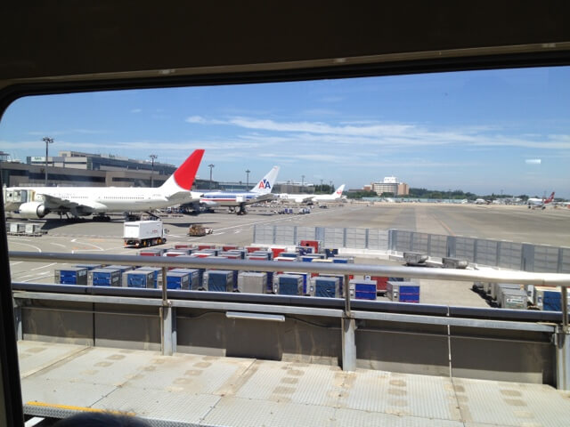
in Narita, Japan and we’re on our way to Dallas. I’m looking forward to being home.

Emmeline, see all the planes lined up? I think the one with “AA” on its tail is mine.

20120717-105355.jpg

For EMM

Departing Seoul

Bekah and I parted company in the Seoul airport, to travel alternate routes and arrive in the same destination.

For EMM

The last night in Korea

Our last night with the Jenkins we had a Korean meal. Emmeline, see how we’re sitting on the floor? That’s how Korean people eat in some restaurants and homes. We all took off our shoes at the door, and everyone in the restaurant wore socks or slippers.

20120717-110013.jpg

For EMM