Typography: Form and Content
It’s not easy to consider the forms of letters without taking into consideration their meaning.
I recently traveled to see some friends and family in China and Korea. While I was there, I was intrigued by the variety of typefaces used in signage and printed material for both Mandarin and Korean. It presented a unique opportunity to evaluate a typeface or font without being influenced by the meaning. (I arrived knowing next to nothing of either language, and managed to preserve my ignorance largely intact after spending a week in each country.) When I look at a typeface containing words I can read, the meaning colors my impression of the typeface.
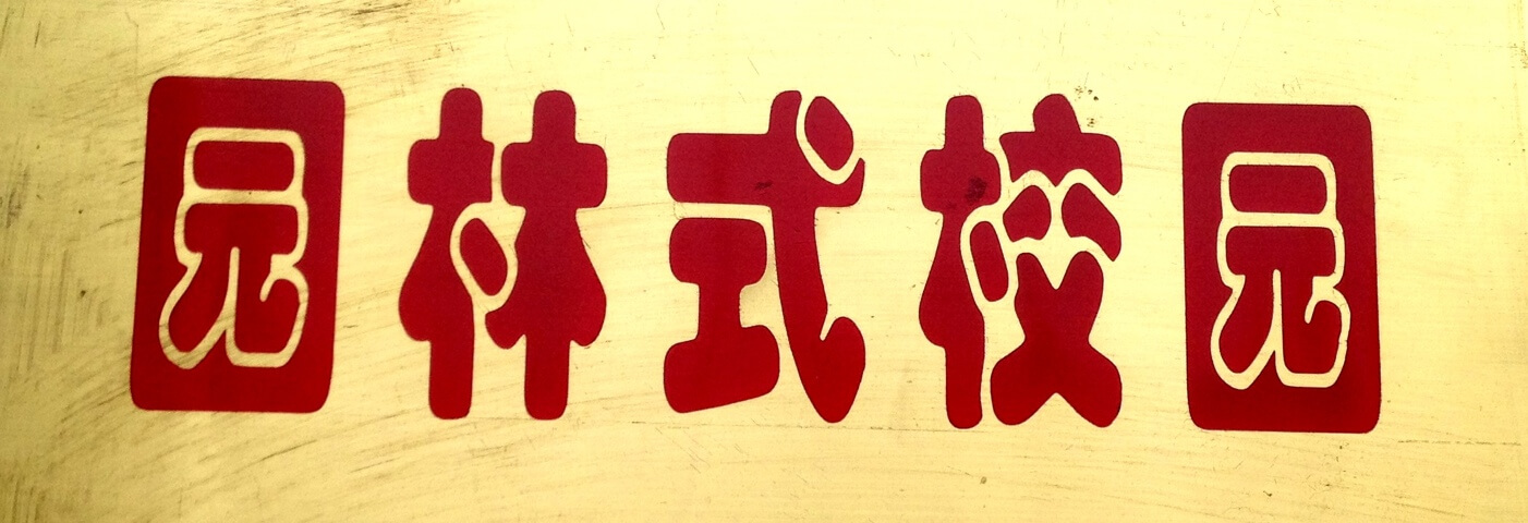
When I saw Chinese characters, however, I didn’t have any choice. The only thing I could understand about the signs and ads in China was the emotional tone or mood created by the way the characters were presented. Take these two signs, for example:
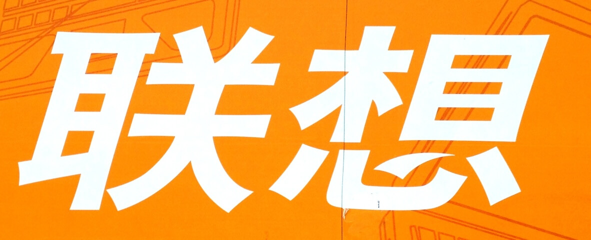
The first, by its crisp lines, conservative coloring and clean presentation, is clearly intended to be taken seriously. It presents itself as professional and respectable; dependable but not stuffy, modern but not informal. This sort of typography would be appropriate for a bank or real estate office, perhaps, but would feel flat on a sports drink or coffee shop.
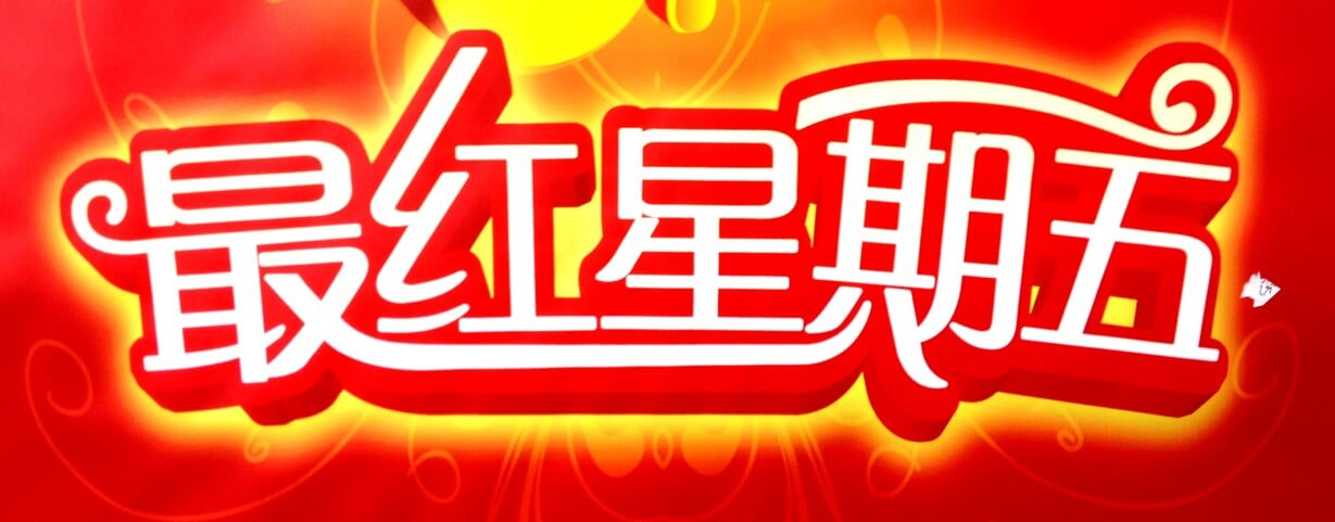
The typography in the second image is loose, playful, casual. The informal shapes of the characters, with their thick, bubbly lines, along with the coloring of the sign, implies a relaxed atmosphere, a business or service where fun is more important than precision. This sort of typography would be appropriate for a pet store or fast food restaurant, but not for an insurance agency or auto mechanic.
I’ve included some other samples of Mandarin typefaces that I found in the streets of Chengdu. They include hand-drawn characters, “serifs” and “sans-serif” varieties, and illustrated letterforms.
(Updated from an earlier post.)
To read more articles like this visit: Design, Identity, Travel, Type Design, Typography


