Design as a public trust–the 2020 Olympics logo and New Zealand’s flag redesign
The four top candidates for the redesign of the New Zealand flag.
Design as a public trust
There are two design-related stories circulating in recent news that have to do with brands that are “public property.” The first is the logo for the 2020 Olympics in Tokyo. The Olympic games feel like they belong to all of humanity, even if they are sponsored and organized by private entities. The second design project in the public eye is the proposed redesign of the flag of New Zealand, which is clearly a “public” symbol, belonging to the people of New Zealand.
The Tokyo 2020 Olympics logo
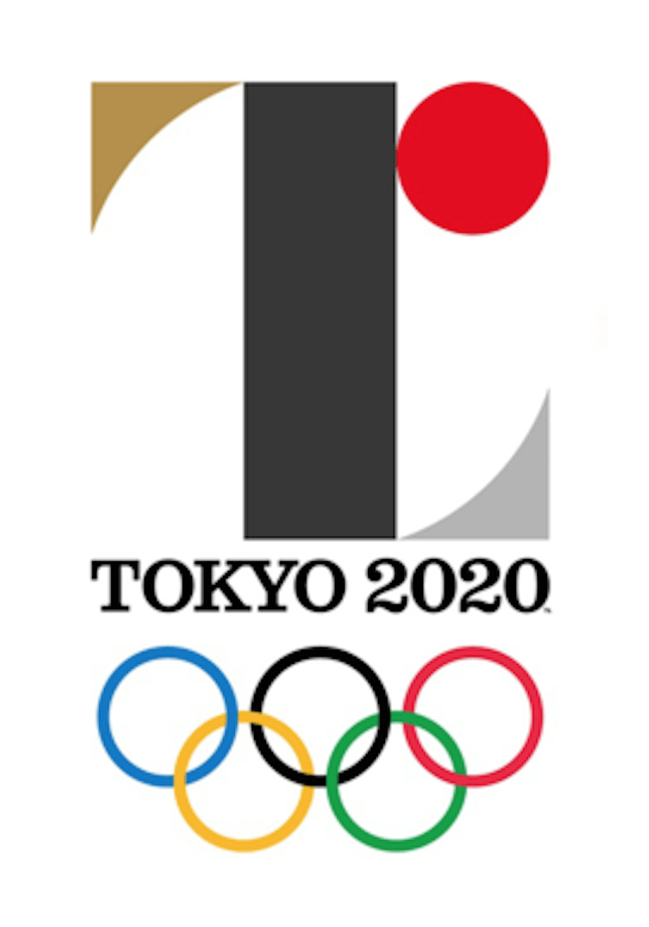
The first story concerns the embattled Tokyo 2020 Olympics logo, which organizers have now decided to scrap. There had already been a fair amount of murmuring when the logo was unveiled, with many people simply disliking it, and some claiming that the mark contained too direct a reference to Japan’s flag. In addition to problems of style and content, almost as soon as the logo was publicly revealed a Belgian designer named Olivier Debie claimed that the proposed logo was a derivative of his own logo design for the Theatre de Liege.
Théâtre de Liège vs Tokyo 2020
#Tokyo2020 #ThéâtredeLiège #plagiat? pic.twitter.com/u64MpWBAI2
— Olivier Debie (@OliDebie) July 28, 2015
The Belgian designer tweeted this GIF, making his case that the Olympic logo was derived from his own earlier logo design.
The designer of the Olympic logo has denied that the design was plagiarized, and I tend to believe him. There are only so many colors and shapes out there, and there are a lot of designers using them in a multitude of contexts. There has also been some controversy around another project carried out by his firm in which they have admitted copying existing designs, and while that doesn’t help his case I think it’s a red herring. A slipshod approach to a small project for regional consumption is one thing, but I can’t imagine that any designer or firm would be careless (or so brazen) with such a high profile project as the Olympic logo.
But in the end it won’t matter where the image originated–the logo has been abandoned. After the early criticism and the latest accusations of plagiarism the organizers stated, “we have reached a conclusion that it would be only appropriate for us to drop the logo and develop a new emblem. At this point, we have decided that the logo cannot gain public support.”
In most cases a logo design only has to please the few people who are stakeholders in an organization. The designer hopes that to those stakeholders the design reflects the character and identity of the company it represents, but “public support” is not a necessary benchmark for success. With something like the Olympic games, though, there’s a sense that they belong to the world community and all of us are stakeholders. And good luck pleasing a committee made up of 7 billion members.
A national redesign, or “How to please 3 million clients”
Another very public design debate is swirling around the ongoing development of a new design for New Zealand’s flag. The current kiwi flag has been a contentious issue for some time and has sparked a national conversation. It’s encouraging to me that at least some of the debate focuses on an idea that should be central to every design project: that a design should be evaluated based on what the design supposed to do–does it accomplish what it is supposed to accomplish or does it not accomplish that goal. The authors of nzflag.com, a site that “promotes debate about New Zealand’s national identity and, in particular, about New Zealand’s flag,” write about what they hope to accomplish:
We want all New Zealanders to ask whether the current flag represents our country as we see ourselves today? Can we improve it? Does it portray the image we want to give of New Zealand internationally? Most importantly, does it inspire us?
After reviewing over 10,000 submissions, a government panel shared this gallery of 40 finalists with the public. Predictably, there were many objections that great designs had been overlooked, and when that selection was narrowed to four final designs. (Some of the commentary was mean-spirited, but a much of it was hilarious.)
The designer’s fiduciary responsibility
The reality is that even though they’re entrusted to a handful of decision-makers, both of these symbols are the “property” of millions of people. Inevitably some of those millions of “clients” won’t get what they want. The designer always has a fiduciary responsibility to represent the people and content as well as they are able and to try to accommodate all stakeholders but on projects of this scale, with audiences this large and diverse, it seems like an impossible task. Because a designer’s work will be seen and used by by the whole community, they have a responsibility to create pieces that resonate with and benefit the public, and not just their clients.
To read more articles like this visit: Branding, Community, Design, Logo Design


