I use this space to gather notes and samples of typefaces. My purpose here is not to be exhaustive, but to learn and be useful in the process.
Serif Sans-serif Italic Script
Say
Hello
I use this space to gather notes and samples of typefaces. My purpose here is not to be exhaustive, but to learn and be useful in the process.
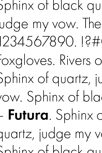
Designed by Paul Renner between 1924 and 1926, Futura was released commercially in 1927 by the Bauer Type Foundry in Frankfurt, Germany.
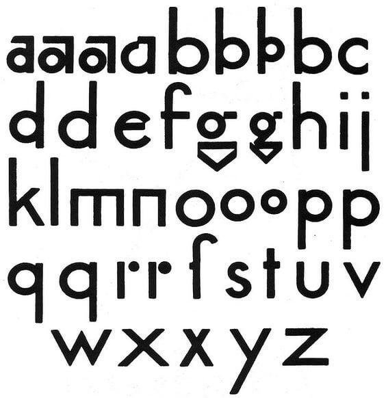
One of Paul Renner’s original drawings for the typeface that would become Futura
Designed by Paul Renner between 1924 and 1926, Futura was released commercially in 1927 by the Bauer Type Foundry in Frankfurt, Germany. In the process of bringing Renner’s initial drawings to metal type, the Bauer designers made adjustments that brought his original concepts for Futura closer in line with traditional typographic letterforms. It is extremely effective as a display font, but can also be pleasant to read in longer form as a text face.
Both Paul Renner and Futura are often associated with the Bauhaus movement, but there is some debate about the interplay between them. While not involved in the Bauhaus, he was influenced by it and by the same cultural and artistic ideas that gave rise to the Bauhaus. Organized around the simple geometric forms of circle, square and triangle, Renner’s original sketches for Futura reflect some of the ideas that had captivated those involved in the movement. In the Bauhaus ideology, a form should be pared down to its essence, stripped of all unnecessary and distracting decoration. They applied this same aesthetic to type—letterforms should be clean, simple shapes, devoid of all embellishments.
Renner is more closely associated with influential designer Jan Tschichold and The New Typography, a movement that predated and was contemporary with the Bauhaus. The movement proposed an approach to graphic design that:
(MOMA has a great online gallery of typographic work that came out of the New Typography movement.)
The enormous commercial success enjoyed by Futura led to the creation of many more geometric sans-serif typefaces in the years after its release. Its influence can be seen in more recent fonts like Avenir, Brandon Grotesque, and Century Gothic. A testament to the power of its simple shape is that it continues to be used widely both in print and (famously) in Stanley Kubrik and Wes Anderson films. It’s also been used in countless logos, including well-known brands like Crayola, Best Buy and Gillette.
![]()
![]()
Futura has been a perennial favorite with print designers, despite its quirks. For their redesign of USA Today, for example, Wolff Olins worked with independent type foundry Bold Monday to create a custom version of Futura. Their version, called Futura Today, aims to be more efficient in terms of space used and more legible.
Notes and sources:
Alexander Lawson, Anatomy of a Typeface
Robert Bringhurst, The Elements of Typographic Style
Ellen Lupton, Thinking With Type
Phillip B. Meggs, A History of Graphic Design
Alan Bartram, Five Hundred Years of Book Design
Wikipedia, among others. Some images from Wikipedia are used under the Creative Commons license, and have been resized.

Paperback helps people tell their stories through a variety of visual media, including print and books, photography, video and environment design. Paperback is based in Sioux Falls, SD.


