I use this space to gather notes and samples of typefaces. My purpose here is not to be exhaustive, but to learn and be useful in the process.
Serif Sans-serif Italic Script
Say
Hello
I use this space to gather notes and samples of typefaces. My purpose here is not to be exhaustive, but to learn and be useful in the process.
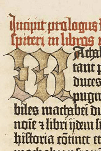
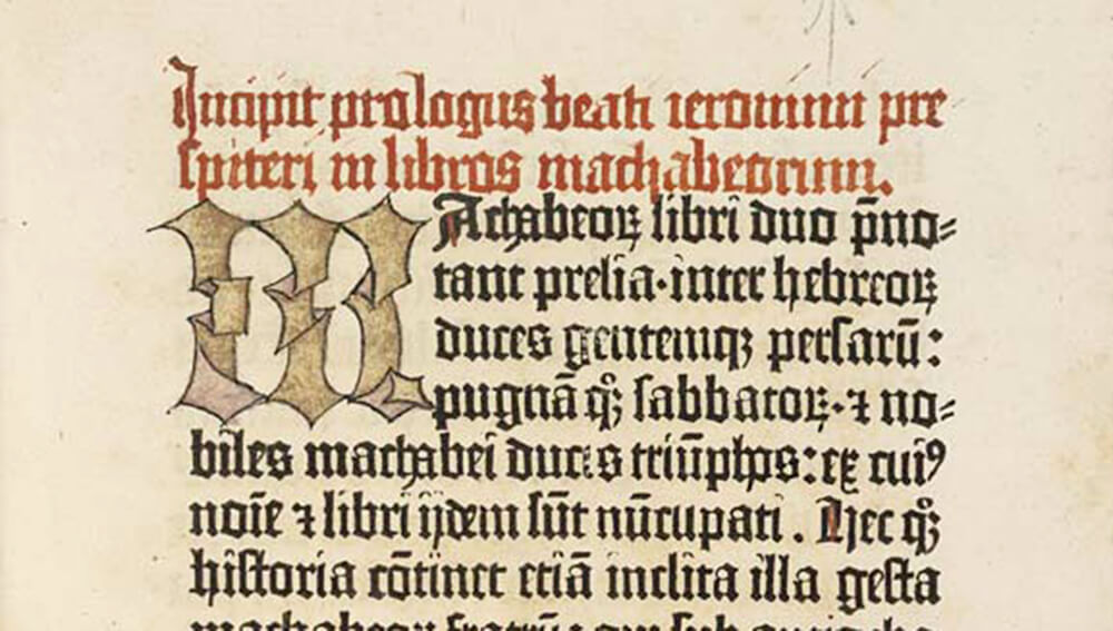
Although we now have typefaces like Franklin Gothic that confuse matters, for much of the history of typography gothic type meant blackletter, like the original typeface used by Johann Gutenberg in his famous printing press. Blackletter was type, but type that emulated the most common handwritten scripts of the era.
Although we now have typefaces like Franklin Gothic that confuse matters, for much of the history of typography gothic type meant blackletter, like the original typeface used by Johann Gutenberg in his famous printing press. Blackletter was type, but type that emulated the most common handwritten scripts of the era. By type, we mean reversed letterforms cut out of metal (or sometimes wood) that were set in a frame, inked, and then pressed into paper to create a printed page. (Here’s a great explanation of the difference between a typeface and a font.) But Blackletter was a style of type that was designed to match what readers at the time were accustomed to read: handwritten manuscripts.
This helpful passage from Frank Chouteau Brown’s Letters and Lettering (1921) explains the origin and the original understanding of the term “Gothic” as applied to type:
The name “Gothic” applies rather to the spirit than to the exact letter forms of the style. The same spirit of freedom and restlessness characterizes the architecture of the period wherein this style of letter was developed; and Gothic letters are in many ways akin to the fundamental forms of Gothic architecture. Their effect is often tiring and confusing to the eye because of the constant recurrence of very similar forms with different letter meanings; yet this very similarity is the main cause of the pleasing aspect of a page of Gothic lettering.
Unlike the Roman letters, which attained a complete and final development, Gothic letters never reached authoritative and definitive forms, any more than did Gothic architecture. Every individual Gothic letter has several quasi-authoritative shapes, and all of these variants may be accepted, as long as they display an intelligent conception of the spirit of the style as a whole. Because of this lack of finality, however, it is impossible to analyze each of the letter forms as we were able to do with the Roman alphabet in Chapter I; yet this very variability and variety constitute at once the peculiar beauty of Gothic and the great difficulty of so drawing it as to preserve its distinctive character.
Any letter of Gothic form is usually called either “Gothic” or “Blackletter” indiscriminately, but this use is inexact and confusing. The term “Blackletter” should, strictly, be applied only to letters in which the amount of black in the line overbalances the white; and the proper application of the title should be determined rather by this balance or weight of the letter than by its form.
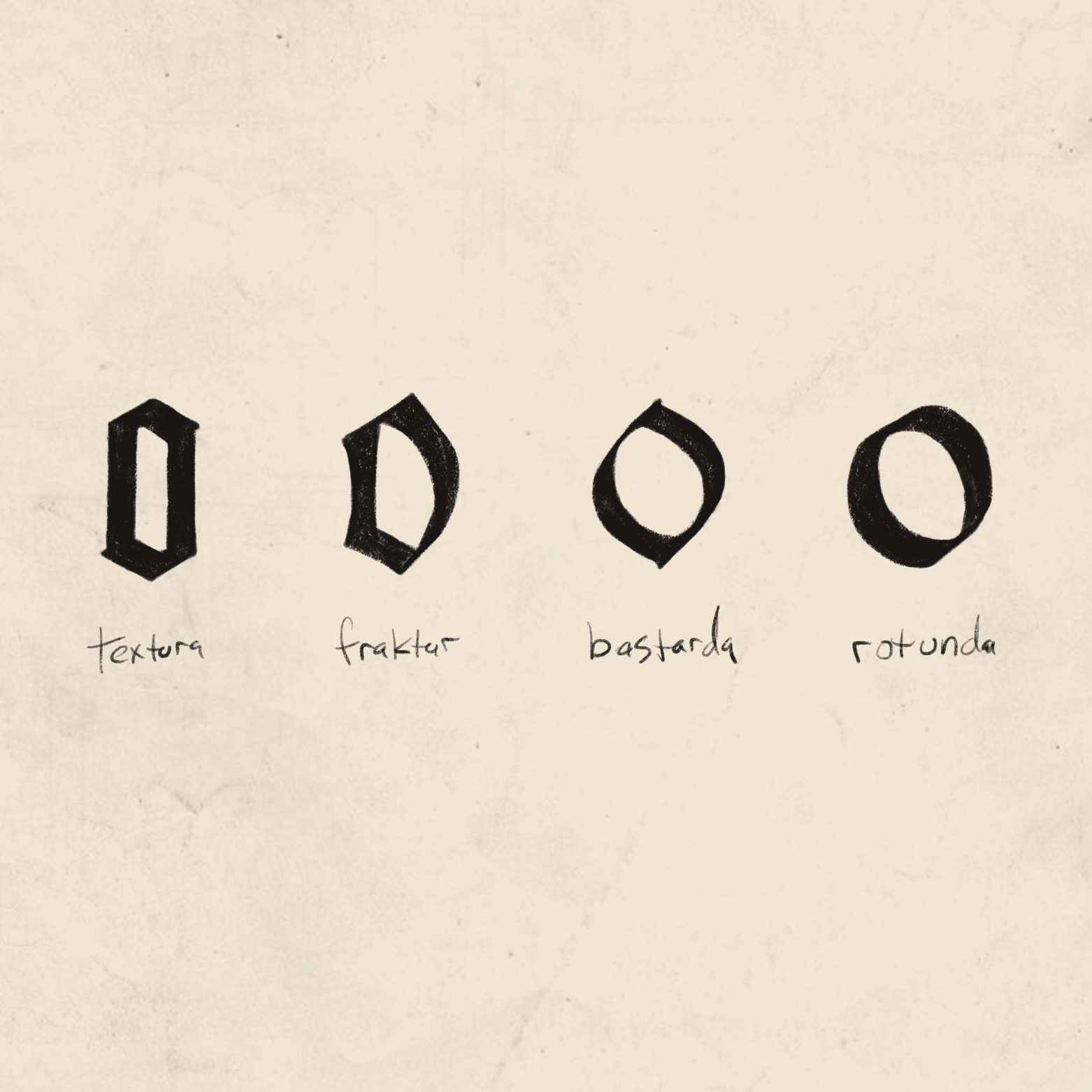
Just like modern type appears in a variety of styles, blackletter can be classified into four principal styles: textura, fraktur, bastarda, and rotunda. (Bastarda is sometimes called by its German name, Schwabacher.) The image above, adapted from Robert Bringhurst’s The Elements of Typographic Style, shows an example of each. According to Bringhurst,
[N]one of these families is confined to a particular historical period. All four of them have survived, like roman and italic [type] through many historical variations. Their differences are many and complex, but they can usually be distinguished by reference to the lowercase o alone. Though it is written with only two penstrokes, the o in a textura looks essentially hexagonal. In a fraktur, it is normally flat on the left side, curved on the right. In a bastarda, it is normally pointed at top and bottom and belled on both sides. In a rotunda it is essentially oval or round. (p. 266)
When Johann Gutenberg began cutting his letters into metal (around 1440), textura was the dominant letter style being used in Germany, so it was natural for him to use that style as the basis for his type. Textura has a strong, very regular vertical rhythm. This made it easier for scribes to write quickly and compactly, but makes it more difficult to read (especially for modern readers) because there is much less variation between the shapes of different letters.
The type most closely associated with German printing, fraktur is said to be based on the the calligraphy of Johann Neudorffer, who lived in Nuremberg in the early 16th century. It was first cut into metal type in 1531 at the request of the Emperor Maximilian, and became the dominant type in Germany for the next 400 years. (Lawson, p. 23)
Compared to the textura letterforms, bastarda tends to be more flowing or cursive. As a written style, this made it easier and quicker to write, causing it to be considered by some at the time as a relaxed or “bastardized” version of the more formal textura style.
Sometimes called southern gothic or round gothic, rotunda lettering has a much more open, human feel. And as the name implies, it is much more round than the other blackletter families. Nicolas Jenson, printing around 1465, won acclaim from his contemporaries for his beautiful books printed in rotunda type. (Lawson, p.21)
For a better understanding of some of the historical context of blackletter, especially how a font that Hitler hated came to be associated with the Third Reich during the era around World War II, and with national socialism in general ever since, I can’t recommend enough this episode of 99% Invisible. (99% Invisible is a podcast that examines explorers “all the thought that goes into the things we don’t think about — the unnoticed architecture and design that shape our world.”)
Notes and sources:
Alexander Lawson, Anatomy of a Typeface
Robert Bringhurst, The Elements of Typographic Style
Ellen Lupton, Thinking With Type
Phillip B. Meggs, A History of Graphic Design
Alan Bartram, Five Hundred Years of Book Design
Wikipedia, among others. Some images from Wikipedia are used under the Creative Commons license, and have been resized.

Paperback helps people tell their stories through a variety of visual media, including print and books, photography, video and environment design. Paperback is based in Sioux Falls, SD.


