Good Design or Lots of Signs
Raise your hand if you’ve ever walked up to a door and pulled, only to find out that it was a “PUSH” door. To make matters worse, as you were fruitlessly pulling on the handle, your wandering eyes fastened on the sign that read, “PUSH.” You’ve been a victim of bad design.
When you or I walk into a coffee shop, or a bank, or a movie theatre, we do not read signs. Generally speaking, if I enter a coffee shop and see someone standing behind the counter, I walk up to them and order a mug of whatever light roast coffee they have, with a little room, please. I won’t have noticed the large sign saying that I should walk to the end of the counter and place my order with the person at the register behind the bakery case. I could walk by five such signs without reading them, because I think I understand the situation and protocol already.
We don’t read signs—we take cues. We navigate most of life by subconsciously reading the situations we find ourselves in and acting on the cues those situations present. We only read signs when the situation is unclear. When we go to a new restaurant, and we’re not sure if we order at the counter or sit at the table, the restaurant has already failed to guide us with cues. The sign that reads, “Please wait to be seated” is a tacit admission that the cues have failed, and that many un-cued patrons have wandered in and seated themselves.
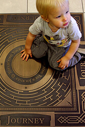
A “PULL” handle on a door is a cue to pull. A line of velvet ropes is a cue to line up. (A cue to queue, if I may.) A floor mat that leads from the door to the counter is a cue to order my coffee where the carpet stops. In future posts, we’ll discuss how these same principles apply to printed materials, office space and web design. How do we provide our audience with cues about how to use our brochure, our office, or our web site?


