When you study something intently, you sometimes lose sight of what made you want to study it.
When readers begin paying attention to a book’s design, it is usually because the design is getting in the way.
For better or worse, the words of the Bible have been studied and parsed and dissected to an extraordinary degree. The pages of most Bibles are littered with notes, numbers and other study aids. But the power of the text can get overshadowed by the clutter of the “helpful” material that has been added. For the most part, Bible designers have been primarily concerned about arming the reader with all of the information he or she might need to interpret the text, and less concerned about the reading experience. While presenting the text along with the scholarly apparatus might help readers to study the text, all that information hovering in the margins and gutter makes it more difficult to read the text. (For more on readability and “the physical form of the Good Book” see J. Mark Bertrand’s Bible Design Blog.)
The Good Book, Designed
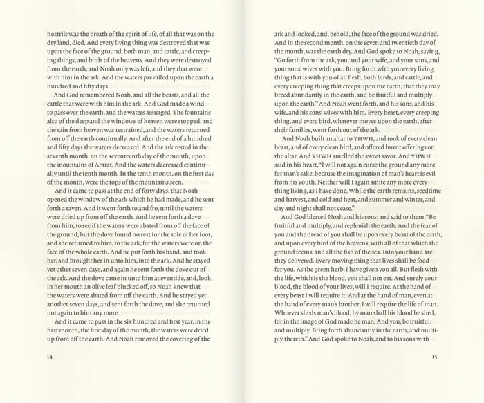
Bibliotheca, a project being funded through Kickstarter, is aimed at presenting a book (in four volumes) that is meant to be read. The goal of the Bibliotheca project is to present the text of the Bible simply and beautifully, with a focus on clean design and “classic and elegant typography” uncluttered by notes and numbers.

I’m looking forward to seeing the finished volumes later this year, for spiritual and professional reasons. The first “book design” project I undertook was motivated by exactly the same reason, with myself as the client. I found myself distracted by the notes and especially the verse and chapter numbers in my reading of the Bible. (To be fair, it doesn’t take much to distract me.) I decided to take the book I was studying and redesign it as simply as I could, with ample space for marginal notes, a narrow measure, and a careful treatment of the poetry sections.
Good book design gets out of the way
When reading a book, what is the reader most interested in: the content, or the form in which the content is presented? Most likely, the reader has picked up a book because she is interested in the information, or the story, or the ideas presented. Unless the book is a design portfolio, where the goal is to display the work of its designer, or a textbook intended to inform about and present examples of design, the reader has only passing interest in how the material is presented visually.
When readers begin paying attention to the features of a book’s design, it is usually because those features are getting in the way–margins too narrow for the reader to hold the book without covering up the text, page numbers that are hard to find, text that is too cramped to follow comfortably, and so on. You could almost say that as soon as the reader becomes aware of the design of the book, the designer has failed in his first goal: present the text to the reader.
Book Design, Books, Design


