4 book recommendations for better typography
Someone recently asked me for recommendations on books about typography and I was nerdishly delighted, because books and typography are two of my favorite subjects.
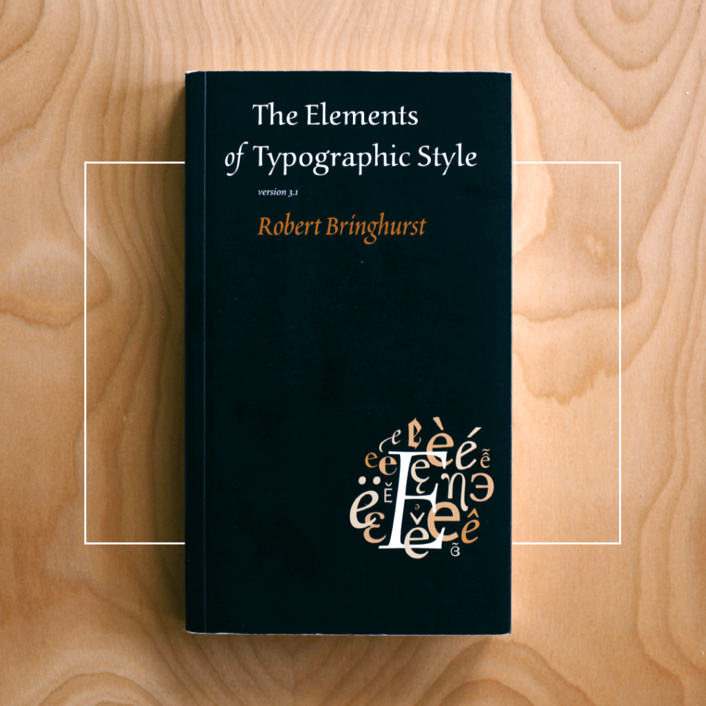
The Elements of Typographic Style
The first book that came to mind was of course Robert Bringhurst’s The Elements of Typographic Style (first published in 1992). For one thing, both the book and language are beautiful. Bringhurst talks about letters the way a Carpenter talks about wood . He is a well-known poet, and letters and type are his material of choice. In this masterful and thorough book, Bringhurst discusses type and page layout in lyric prose, both in terms of design and page layout and from a historical standpoint. It’s a great resource to use as a reference with an easy-to-use index, and a detailed look at typographic best practices that have been the hallmarks of good style for the 500 years or so.
As he says in his foreword, “If you use this book as a guide, by all means leave the road when you wish. That is precisely the use of a road: to reach individually chosen points of departure. By all means break the rules, and break them beautifully, deliberately and well. That is one of the ends for which they exist.” If you want to use type well and you read only one book on typography, this should be it.
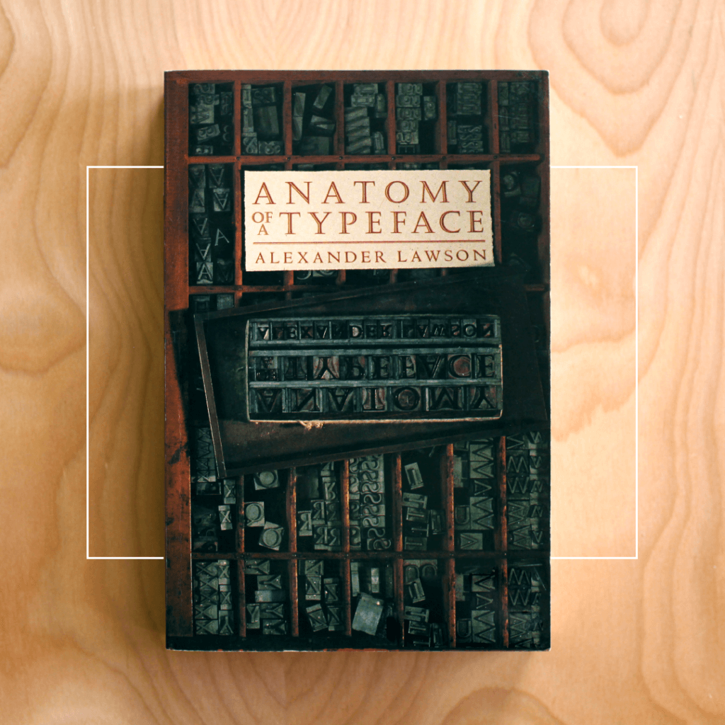
Anatomy of a Typeface
The second book I would recommend is Alexander Lawsons, Anatomy of a Typeface (1990). In this book Lawson rights what amounts to a biography of a couple dozen of the most influential typefaces since the early days of Western movable type. He writes about the origin of each typeface, the influences that led to their creation, and some of the stories of their creators which are as interesting and varied as the typefaces he discusses.
The book is arranged chronologically, starting with the earliest typefaces of the 20th century (Goudy and his Blackletter type) and ending with type that may be more familiar to modern eyes (Futura and other geometric sans serif types). It also provides an overview of the methods and techniques used to print those typefaces, and explores how those printing methods help shape the forms of the letters themselves.
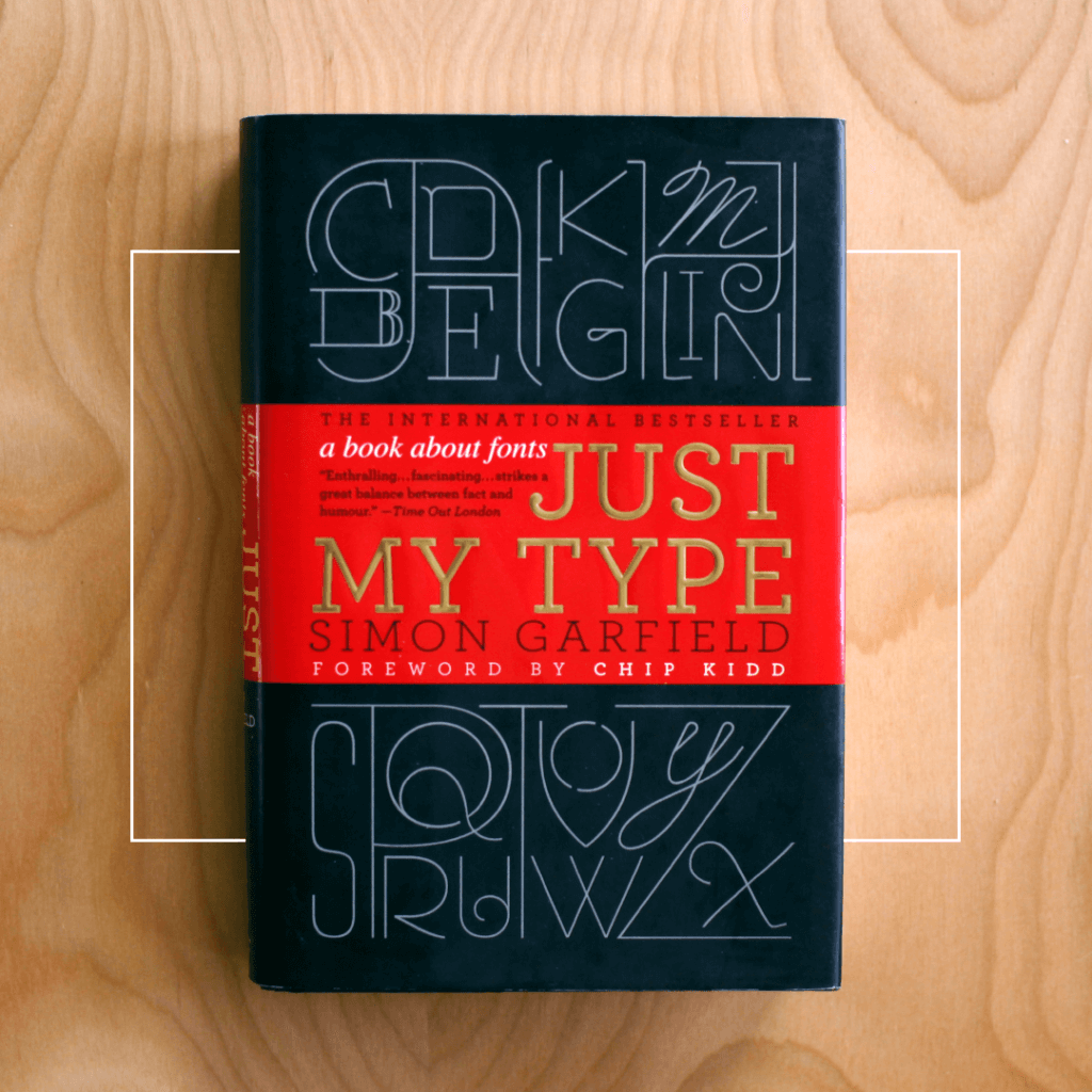
Just My Type
While the first two books I mentioned have a more academic tone, Simon Garfield’s, Just My Type (2011) is light-hearted and irreverent, but equally informative. The book opens with an introduction by Chip Kidd which includes examples of type from his own work and from around the history of typography and use. The introduction is almost worth the purchase price.
The book explores everything from the appropriateness of using comic sands and the inappropriate use of all caps to the last chapter in the book comma the worst fonts in the world. It’s a great sampling of both the history of typographic design and best practices for using type in modern graphic design contexts.
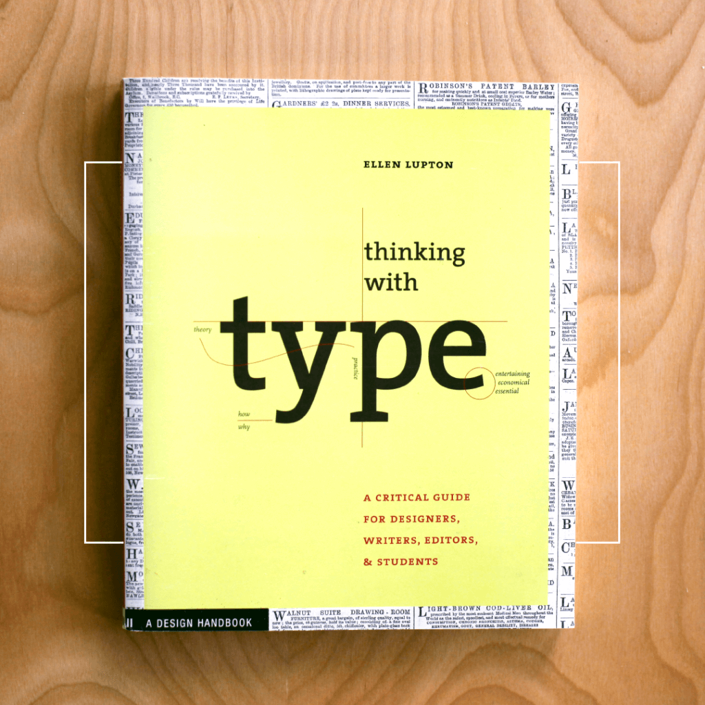
Thinking With Type
Anyone who’s taken anything like an “Intro to Graphic Design” class in the last 15 years probably has Ellen Lupton’s Thinking With Type (2004) on their shelves, and for good reason. It’s interesting and accessible, and does a great job of systematically explaining how a designer uses type (and layout) to make information clear to the audience. More than the other three books mentioned above, Thinking With Type explores how and why a designer chooses and uses different typefaces, with helpful discussions of type mechanics, grids, and information hierarchy among other topics.
“Typography is what thought looks like.”
The very first page says, “Typography is what language looks like.” I agree, and because we are a society that reads more that we speak, I would push that even further: “Typography is what thought looks like.”
To read more articles like this visit: Uncategorized