Redesigning money: new concepts for printed Norwegian and US currency

The design of the physical money in our pockets says volumes about us: how we see ourselves as a nation; what we value as a nation (or at least what we say we value); what we consider to be quintessential elements of our national identity. It’s a daunting task to create a design that captures the essence of a country well enough to represent that country on its currency. In the last week we’ve seen two highly imaginative treatments of currency, one real and one hypothetical.
The real…
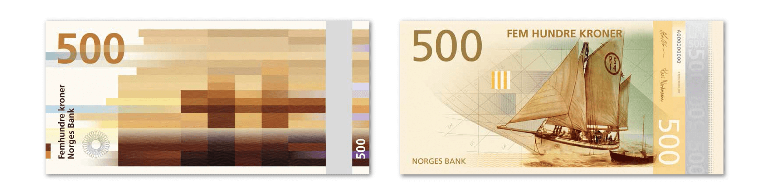
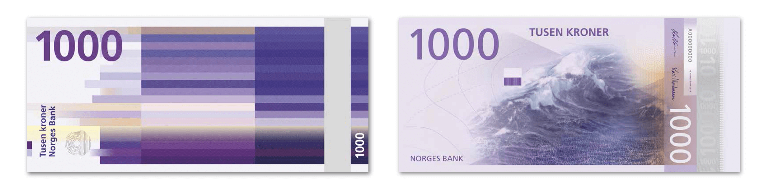
Norges Bank, the central bank of Norway, unveiled a new set of design concepts for their printed kroner. The final concepts for the currency redesign were chosen from submissions by a number of design agencies. In a somewhat unusual move, the final designs will be a hybrid of two different teams’ concepts–the front from one design team and the back from another, according to a press release from the central bank:
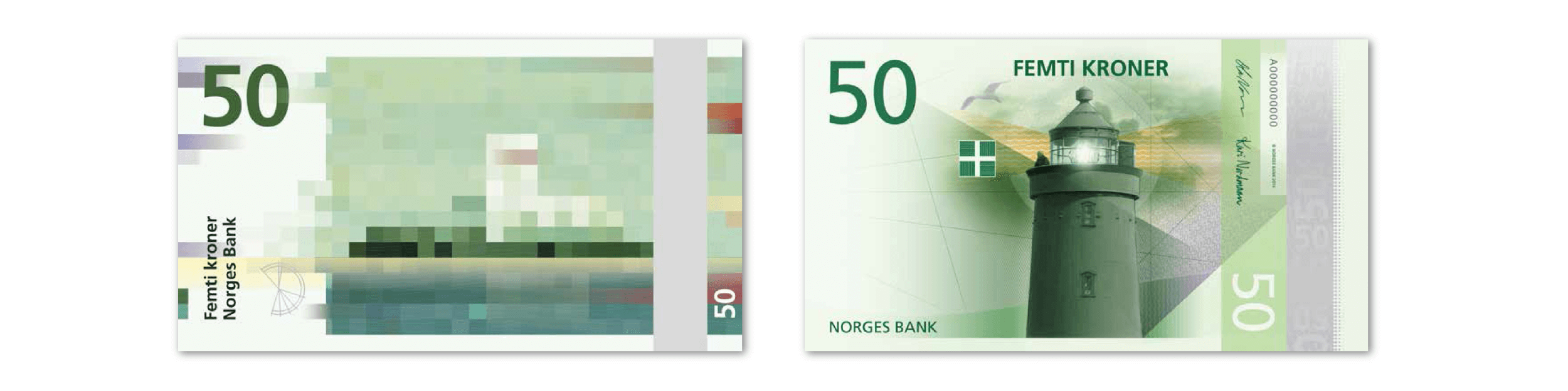
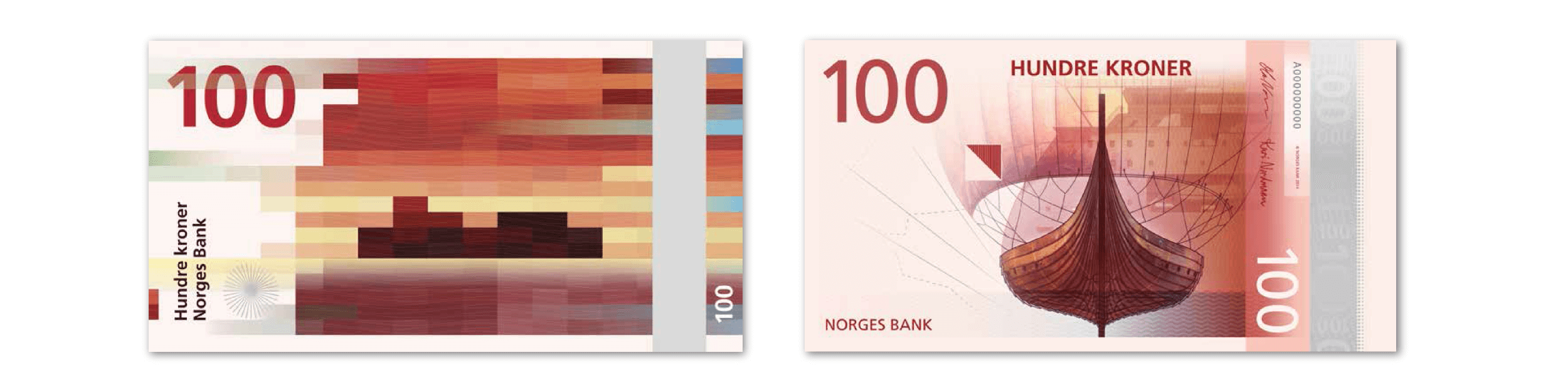
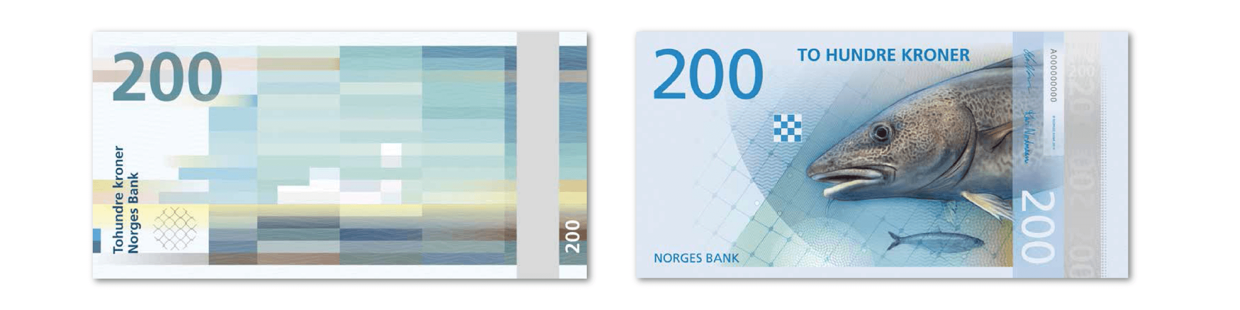
Norges Bank has decided that a combination of two proposals submitted will go on for further work. The obverse sides of the notes will be developed on the basis of the proposal from The Metric System, Norwegian Living Space. The basis of the reverse sides will be the pixel motifs submitted by Snøhetta Design, Beauty of Boundaries.
The teams involved took visual elements that represented the country and created a series of compositions, one for each denomination– 50, 100, 200, 500, 1000 kroner. One of the challenges was to create a set of images that were easy to differentiate at a glance, but also hung together as a cohesive set. On top of that were all the requirements put in place to foil or frustrate would-be counterfeiters.
Scheduled for a 2017 release, the final designs may look differently than these initial concepts, but the overall approach has been chosen. Here are the combined obverse and reverse of the proposed bills:
You can see more images of the winning designs and read some more of the thought behind those designs in Fast Company’s behind-the-scenes article. You can see also the “B sides” from each design firm, as well as some of the other concepts that were considered in this PDF from the bank. (If you read Norwegian and would like to write a synopsis, I’d be happy to repost it here.)
…And the hypothetical
Just as compelling are these hypothetical redesign concepts for US currency submitted to the public by a Redditor sometime last week. It’s a beautiful reimagining of the printed currency that I would be equally glad to spend or to hang on my wall. I appreciate the subtlety of the set, and the strong geometry in each composition.
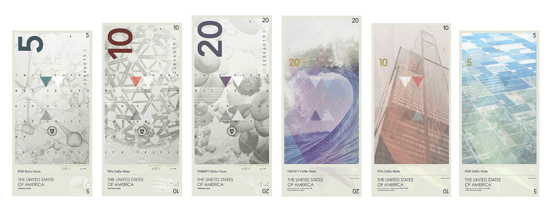
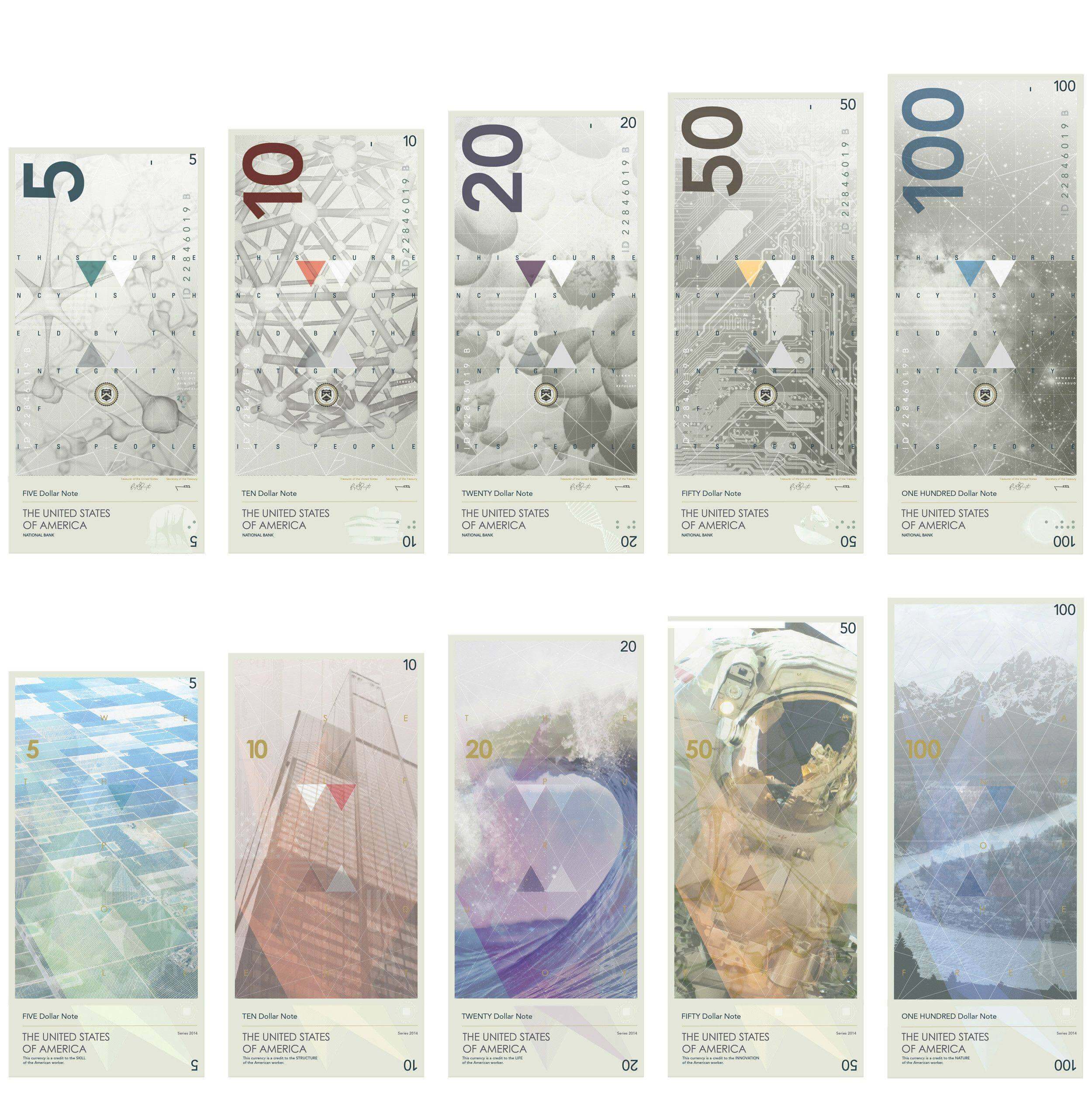
I don’t have any illusions that there will be a major redesign of the US currency anytime soon, but they’re beautiful to behold and I’m glad they’re out there.
Tim Murray is a designer based in Sioux Falls, SD. Follow him on Twitter or Facebook to read future posts.
To read more articles like this visit: Design