“Hermann Zapf has magic hands”
Hermann Zapf’s typeface Palatino found a place in Alexander Lawson’s classic Anatomy of a Typeface
Hermann Zapf, a legend in the world of calligraphy and type design, passed away on June 4th, 2015. He was 96.
Many people may associate Mr. Zapf with Zapfino, the elegant script typeface that bears his name, but he created an impressive array of other beautiful and well-known typefaces including Palatino, Optima and hundreds of others. For more on his contribution and images of his work, read this remembrance or this brief biography.
Early career
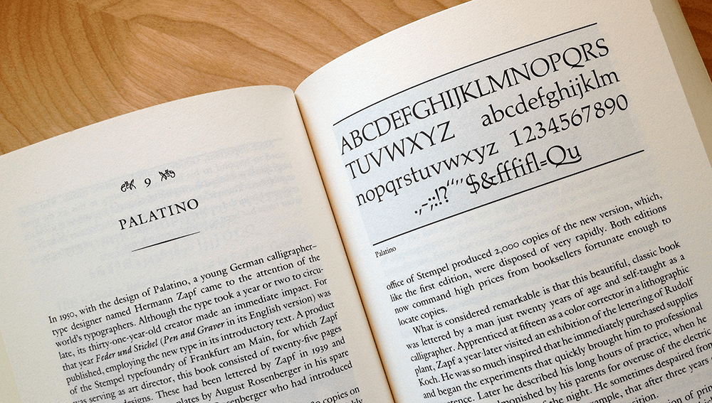
One of the interesting parts of Mr. Zapf’s career and early success is that he was largely self-taught. After an initial interest in engineering, he was drawn to lettering and calligraphy, and then to type design. Writing about the book that first introduced Zapf’s alphabet designs to the public Alexander Lawson notes:
What is considered remarkable is that this beautiful, classic book was lettered by a man just twenty years of age and self-taught as a calligrapher. Apprenticed at fifteen as color corrector in a lithographic plant, Zapf a year later visited an exhibition of the lettering of Rudolf Koch. He was so much inspired that he immediately purchased supplies and began the experiments that quickly brought him to professional competence. Later he described long hours of practice, when he was frequently admonished by his parents for overuse of the electric lights in the small hours of the night. He sometimes despaired from lack of guidance–discovering, for example, that after three years of effort, he was holding his pen in the wrong position.
Anatomy of a Typeface, p121
“A deep and beautiful mark”
“He picks up a pen and makes a mark with it and it’s a deep and beautiful mark.”
Someone who knew Hermann Zapf and who is more qualified than I am to speak about both his skill and his contribution to the world of typography is Robert Bringhurst, arguably one of the most authoritative voices in the field. Bringhurst’s carefully written and beautifully designed The Elements of Typographic Style is considered the typographer’s bible. In a wide-ranging interview with Type Radio several years ago, he spoke briefly about Hermann Zapf’s depth of skill and his intimacy with the craft of creating letterforms:
I only have to be in the same room with Hermann Zapf for about five seconds before it becomes perfectly obvious to me that he is the sort of person who should be designing type, and I’m the sort of person who should be talking about it. Hermann has magic hands. He picks up a pen and makes a mark with it and it’s a deep and beautiful mark. I don’t have those kinds of hands.
(Robert Bringhurst on Type Radio, 13:00-13:30)
The 1967 documentary below begins with an effortless demonstration by the young Hermann Zapf of the “magic hands” that Bringhurst describes. (Incidentally, in speaking about Hermann Zapf’s talent for designing type, Mr. Bringhurst provides a perfect example of why he himself is “the sort of person who should be talking about it.” Mr. Bringhurst’s first calling is as a poet, and there may be no one who has written as evocatively about typography as he has.)
Although the documentary is a little dated, it’s easy to see a spark of the mind and hands behind Mr. Zapf’s work. I am grateful for his contribution and he will be missed–the world is more beautiful because of Hermann Zapf’s “magic hands.”
To read more articles like this visit: Community, Design, Type Design, Typography